Modal
A modal is an overlay element which blocks interaction with elements outside it.
Vanilla CSS theme
This sets the
--tint CSS variable used by the Vanilla CSS examples.Theme
isDismissable
isKeyboardDismissDisabled
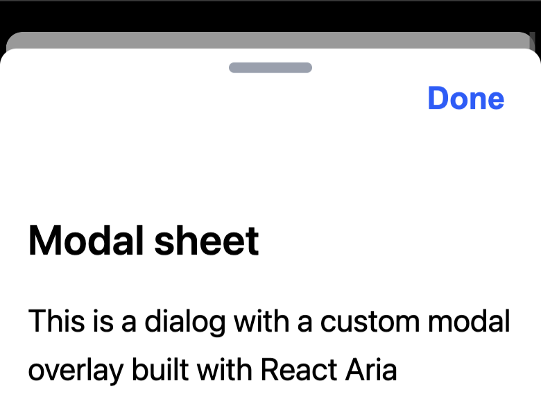
Sheet
Overlays such as trays, drawers, and sheets can be built using a Modal with custom entry and exit animations.
Example
Sheet.tsx
Sheet.css
Example
Sheet.tsx
Sheet.css
Example
Sheet.tsx
Sheet.css
import {DialogTrigger, Heading} from 'react-aria-components';
import {Sheet} from './Sheet';
import {Button} from './Button';

<DialogTrigger>
  <Button>Open sheet</Button>
  <Sheet>
    <Heading slot="title">Notice</Heading>
    <p>This is a modal with a custom modal overlay.</p>
    <Button slot="close">Close</Button>
  </Sheet>
</DialogTrigger>
Controlled
Use the isOpen prop to show a modal programmatically or mount in a different part of the JSX tree (e.g. outside a menu).
import {useState} from 'react';
import {Heading} from 'react-aria-components';
import {MenuButton, MenuItem} from './Menu';
import {Modal} from './Modal';
import {Dialog} from './Dialog';
import {Button} from './Button';

function Example() {
  let [isOpen, setOpen] = useState(false);

  return (
    <>
      <MenuButton label="Menu">
        <MenuItem onAction={() => setOpen(true)}>Open dialog…</MenuItem>
      </MenuButton>
      <Modal isDismissable isOpen={isOpen} onOpenChange={setOpen}>
        <Dialog>
          <Heading slot="title">Notice</Heading>
          <p>Click outside or press Escape to close this dialog.</p>
        </Dialog>
      </Modal>
    </>
  );
}
Custom trigger
DialogTrigger works with any pressable React Aria component (e.g. Button, Link, etc.). Use the <Pressable> component or usePress hook to wrap a custom trigger element such as a third party component or DOM element.
Custom trigger
import {Pressable, DialogTrigger, Heading} from 'react-aria-components';
import {Modal} from './Modal';
import {Dialog} from './Dialog';
import {Button} from './Button';

<DialogTrigger>
  <Pressable>
    <span role="button">Custom trigger</span>
  </Pressable>
  <Modal>
    <Dialog>
      <Heading slot="title">Dialog</Heading>
      <p>This dialog was triggered by a custom button.</p>
      <Button slot="close">Close</Button>
    </Dialog>
  </Modal>
</DialogTrigger>
const CustomTrigger = React.forwardRef((props, ref) => (
  <button {...props} ref={ref} />
));