Popover
A popover is an overlay element positioned relative to a trigger.
Vanilla CSS theme
This sets the
--tint CSS variable used by the Vanilla CSS examples.Theme
placement
shouldFlip
Custom trigger
DialogTrigger works with any pressable React Aria component (e.g. Button, Link, etc.). Use the <Pressable> component or usePress hook to wrap a custom trigger element such as a third party component or DOM element.
Custom trigger
import {Pressable, DialogTrigger} from 'react-aria-components';
import {Popover} from './Popover';

<DialogTrigger>
  <Pressable>
    <span role="button">Custom trigger</span>
  </Pressable>
  <Popover style={{padding: 16}}>
    This popover was triggered by a custom button.
  </Popover>
</DialogTrigger>
const CustomTrigger = React.forwardRef((props, ref) => (
  <button {...props} ref={ref} />
));
Custom anchor
To position a popover relative to a different element than its trigger, use the triggerRef and isOpen props instead of <DialogTrigger>. onOpenChange will be called when the user closes the popover.
Popover will be positioned relative to me
import {useState, useRef} from 'react';
import {Popover} from './Popover';
import {Heading} from 'react-aria-components';
import {Button} from './Button';

function Example() {
  let [isOpen, setOpen] = useState(false);
  let triggerRef = useRef(null);

  return (
    <div>
      <Button onPress={() => setOpen(true)}>Trigger</Button>
      <span ref={triggerRef} style={{paddingLeft: 12}}>Popover will be positioned relative to me</span>
      <Popover
        style={{padding: 16}}
        triggerRef={triggerRef}
        isOpen={isOpen}
        onOpenChange={setOpen}>
        I'm over here!
      </Popover>
    </div>
  );
}
Examples
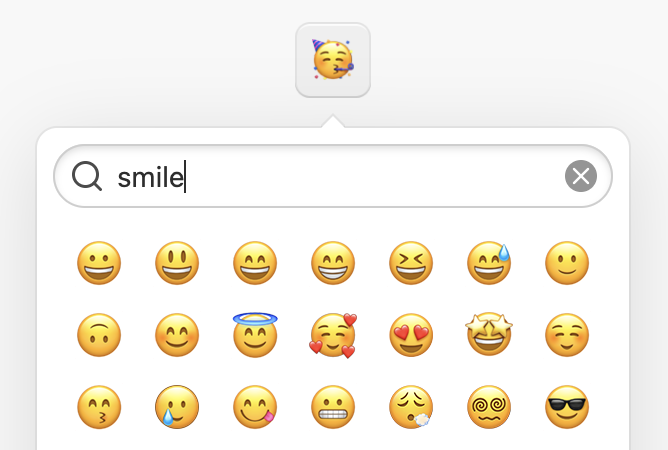 Emoji PickerWith autocomplete, virtualized scrolling, and keyboard navigation.
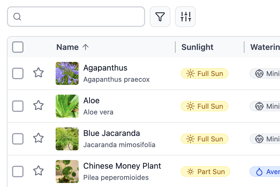 Filterable CRUD TableTable with search, filters, column resizing, and form validation.