useTagGroup
Provides the behavior and accessibility implementation for a tag group component. A tag group is a focusable list of labels, categories, keywords, or other items, with support for keyboard navigation and removal.
| install | yarn add @react-aria/tag |
|---|---|
| version | 3.0.0-rc.0 |
| usage | import {useTagGroup} from '@react-aria/tag' |
API#
useTagGroup<T>(
  props: AriaTagGroupOptions<T>,
  state: ListState<T>,
  ref: RefObject<HTMLElement>
): TagGroupAria
useTag<T>(
  props: AriaTagProps<T>,
  state: ListState<T>,
  ref: RefObject<FocusableElement>
): TagAria
Features#
- Exposed to assistive technology as a grid using ARIA
- Keyboard navigation support including arrow keys, home/end, page up/down, and delete
- Keyboard focus management and cross browser normalization
- Labeling support for accessibility
- Support for mouse, touch, and keyboard interactions
Anatomy#
A tag group consists of a list of tags.
If a visual label is not provided, then an aria-label or
aria-labelledby prop must be passed to identify the tag group to assistive technology.
Individual tags should include a visual label, and may optionally include icons or a remove button.
useTagGroup returns props for the group and its label, which you should spread
onto the appropriate element:
| Name | Type | Description |
gridProps | DOMAttributes | Props for the tag grouping element. |
labelProps | DOMAttributes | Props for the tag group's visible label (if any). |
descriptionProps | DOMAttributes | Props for the tag group description element, if any. |
errorMessageProps | DOMAttributes | Props for the tag group error message element, if any. |
useTag returns props for an individual tag:
| Name | Type | Description |
rowProps | DOMAttributes | Props for the tag row element. |
gridCellProps | DOMAttributes | Props for the tag cell element. |
removeButtonProps | AriaButtonProps | Props for the tag remove button. |
allowsRemoving | boolean | Whether the tag can be removed. |
isPressed | boolean | Whether the item is currently in a pressed state. |
isSelected | boolean | Whether the item is currently selected. |
isFocused | boolean | Whether the item is currently focused. |
isDisabled | boolean | Whether the item is non-interactive, i.e. both selection and actions are disabled and the item may
not be focused. Dependent on |
allowsSelection | boolean | Whether the item may be selected, dependent on selectionMode, disabledKeys, and disabledBehavior. |
In order to be correctly identified to assistive technologies and enable proper keyboard navigation, the tag group should use gridProps on its outer container.
Each individual tag should use rowProps on its outer container, and use gridCellProps on an inner container.
Example#
import {useTag, useTagGroup} from '@react-aria/tag';
import {useListState} from '@react-stately/list';
import {Item} from '@react-stately/collections';
import {useFocusRing} from '@react-aria/focus';
// Reuse the Button from your component library. See below for details.
import {Button} from 'your-component-library';
function TagGroup(props) {
let {
label,
description,
errorMessage,
validationState,
allowsRemoving,
onRemove
} = props;
let ref = React.useRef(null);
let state = useListState(props);
let {
gridProps,
labelProps,
descriptionProps,
errorMessageProps
} = useTagGroup(props, state, ref);
return (
<div ref={ref} className="tag-group">
<div {...labelProps}>{label}</div>
<div {...gridProps}>
{[...state.collection].map((item) => (
<Tag
{...item.props}
key={item.key}
item={item}
state={state}
allowsRemoving={allowsRemoving}
onRemove={onRemove}
>
{item.rendered}
</Tag>
))}
</div>
{description && (
<div {...descriptionProps} className="description">
{description}
</div>
)}
{errorMessage && validationState === 'invalid' && (
<div {...errorMessageProps} className="error-message">
{errorMessage}
</div>
)}
</div>
);
}
function Tag(props) {
let { item, state, allowsRemoving, onRemove } = props;
let ref = React.useRef(null);
let { focusProps } = useFocusRing({ within: true });
let { rowProps, gridCellProps, labelProps, removeButtonProps } = useTag(
{
...props,
item,
allowsRemoving,
onRemove
},
state,
ref
);
return (
<span
ref={ref}
{...rowProps}
{...focusProps}
>
<div {...gridCellProps}>
<span {...labelProps}>{item.rendered}</span>
{allowsRemoving && <Button {...removeButtonProps}>❎</Button>}
</div>
</span>
);
}
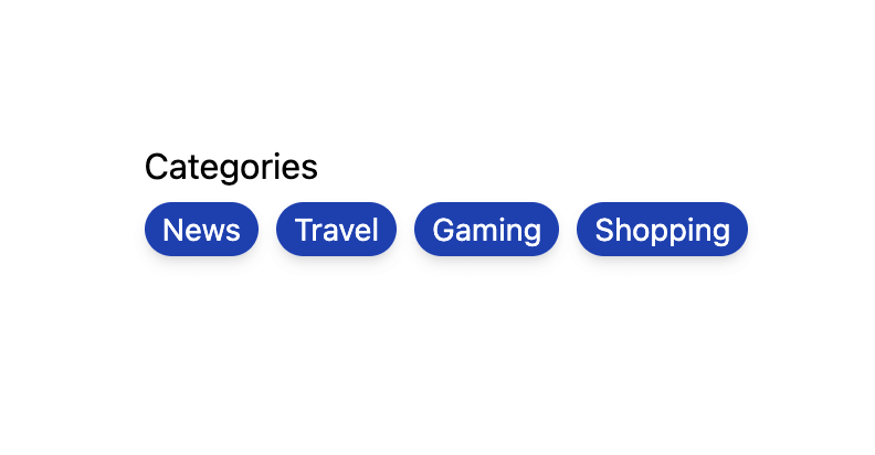
<TagGroup label="Categories">
<Item key="news">News</Item>
<Item key="travel">Travel</Item>
<Item key="gaming">Gaming</Item>
<Item key="shopping">Shopping</Item>
</TagGroup>import {useTag, useTagGroup} from '@react-aria/tag';
import {useListState} from '@react-stately/list';
import {Item} from '@react-stately/collections';
import {useFocusRing} from '@react-aria/focus';
// Reuse the Button from your component library. See below for details.
import {Button} from 'your-component-library';
function TagGroup(props) {
let {
label,
description,
errorMessage,
validationState,
allowsRemoving,
onRemove
} = props;
let ref = React.useRef(null);
let state = useListState(props);
let {
gridProps,
labelProps,
descriptionProps,
errorMessageProps
} = useTagGroup(props, state, ref);
return (
<div ref={ref} className="tag-group">
<div {...labelProps}>{label}</div>
<div {...gridProps}>
{[...state.collection].map((item) => (
<Tag
{...item.props}
key={item.key}
item={item}
state={state}
allowsRemoving={allowsRemoving}
onRemove={onRemove}
>
{item.rendered}
</Tag>
))}
</div>
{description && (
<div {...descriptionProps} className="description">
{description}
</div>
)}
{errorMessage && validationState === 'invalid' && (
<div
{...errorMessageProps}
className="error-message"
>
{errorMessage}
</div>
)}
</div>
);
}
function Tag(props) {
let { item, state, allowsRemoving, onRemove } = props;
let ref = React.useRef(null);
let { focusProps } = useFocusRing({ within: true });
let {
rowProps,
gridCellProps,
labelProps,
removeButtonProps
} = useTag(
{
...props,
item,
allowsRemoving,
onRemove
},
state,
ref
);
return (
<span
ref={ref}
{...rowProps}
{...focusProps}
>
<div {...gridCellProps}>
<span {...labelProps}>{item.rendered}</span>
{allowsRemoving && (
<Button {...removeButtonProps}>❎</Button>
)}
</div>
</span>
);
}
<TagGroup label="Categories">
<Item key="news">News</Item>
<Item key="travel">Travel</Item>
<Item key="gaming">Gaming</Item>
<Item key="shopping">Shopping</Item>
</TagGroup>import {
useTag,
useTagGroup
} from '@react-aria/tag';
import {useListState} from '@react-stately/list';
import {Item} from '@react-stately/collections';
import {useFocusRing} from '@react-aria/focus';
// Reuse the Button from your component library. See below for details.
import {Button} from 'your-component-library';
function TagGroup(
props
) {
let {
label,
description,
errorMessage,
validationState,
allowsRemoving,
onRemove
} = props;
let ref = React.useRef(
null
);
let state =
useListState(props);
let {
gridProps,
labelProps,
descriptionProps,
errorMessageProps
} = useTagGroup(
props,
state,
ref
);
return (
<div
ref={ref}
className="tag-group"
>
<div
{...labelProps}
>
{label}
</div>
<div
{...gridProps}
>
{[
...state
.collection
].map((item) => (
<Tag
{...item
.props}
key={item
.key}
item={item}
state={state}
allowsRemoving={allowsRemoving}
onRemove={onRemove}
>
{item
.rendered}
</Tag>
))}
</div>
{description && (
<div
{...descriptionProps}
className="description"
>
{description}
</div>
)}
{errorMessage &&
validationState ===
'invalid' &&
(
<div
{...errorMessageProps}
className="error-message"
>
{errorMessage}
</div>
)}
</div>
);
}
function Tag(props) {
let {
item,
state,
allowsRemoving,
onRemove
} = props;
let ref = React.useRef(
null
);
let { focusProps } =
useFocusRing({
within: true
});
let {
rowProps,
gridCellProps,
labelProps,
removeButtonProps
} = useTag(
{
...props,
item,
allowsRemoving,
onRemove
},
state,
ref
);
return (
<span
ref={ref}
{...rowProps}
{...focusProps}
>
<div
{...gridCellProps}
>
<span
{...labelProps}
>
{item.rendered}
</span>
{allowsRemoving &&
(
<Button
{...removeButtonProps}
>
❎
</Button>
)}
</div>
</span>
);
}
<TagGroup label="Categories">
<Item key="news">
News
</Item>
<Item key="travel">
Travel
</Item>
<Item key="gaming">
Gaming
</Item>
<Item key="shopping">
Shopping
</Item>
</TagGroup>Show CSS
/* css */
.tag-group {
  display: flex;
  flex-direction: column;
}

.tag-group div {
  margin: 5px 0;
}

.tag-group [role="grid"] {
  display: flex;
  flex-wrap: wrap;
}

.tag-group [role="row"] {
  display: flex;
  align-items: center;
  border: 1px solid gray;
  border-radius: 4px;
  padding: 2px 5px;
  margin: 2px;
}

.tag-group [role="gridcell"] {
  margin: 0 5px;
}

.tag-group [role="row"] button {
  background: none;
  border: none;
  padding-right: 0;
}

.tag-group .description {
  font-size: 12px;
}

.tag-group .error-message {
  color: red;
  font-size: 12px;
}
/* css */
.tag-group {
display: flex;
flex-direction: column;
}
.tag-group div {
margin: 5px 0;
}
.tag-group [role="grid"] {
display: flex;
flex-wrap: wrap;
}
.tag-group [role="row"] {
display: flex;
align-items: center;
border: 1px solid gray;
border-radius: 4px;
padding: 2px 5px;
margin: 2px;
}
.tag-group [role="gridcell"] {
margin: 0 5px;
}
.tag-group [role="row"] button {
background: none;
border: none;
padding-right: 0;
}
.tag-group .description {
font-size: 12px;
}
.tag-group .error-message {
color: red;
font-size: 12px;
}/* css */
.tag-group {
display: flex;
flex-direction: column;
}
.tag-group div {
margin: 5px 0;
}
.tag-group [role="grid"] {
display: flex;
flex-wrap: wrap;
}
.tag-group [role="row"] {
display: flex;
align-items: center;
border: 1px solid gray;
border-radius: 4px;
padding: 2px 5px;
margin: 2px;
}
.tag-group [role="gridcell"] {
margin: 0 5px;
}
.tag-group [role="row"] button {
background: none;
border: none;
padding-right: 0;
}
.tag-group .description {
font-size: 12px;
}
.tag-group .error-message {
color: red;
font-size: 12px;
}Button#
The Button component is used in the above example to remove a tag. It is built using the useButton hook, and can be shared with many other components.
Show code
import {useButton} from '@react-aria/button';

function Button(props) {
  let ref = React.useRef(null);
  let {buttonProps} = useButton(props, ref);
  return <button {...buttonProps} ref={ref}>{props.children}</button>;
}
import {useButton} from '@react-aria/button';
function Button(props) {
let ref = React.useRef(null);
let { buttonProps } = useButton(props, ref);
return (
<button {...buttonProps} ref={ref}>
{props.children}
</button>
);
}
import {useButton} from '@react-aria/button';

function Button(props) {
  let ref = React.useRef(
    null
  );
  let { buttonProps } =
    useButton(
      props,
      ref
    );
  return (
    <button
      {...buttonProps}
      ref={ref}
    >
      {props.children}
    </button>
  );
}
Styled examples#
Usage#
Remove tags#
The onRemove handler and allowsRemoving props can be used to include a remove button which can be used to remove a tag. This allows the user to press the remove button, or press the backspace key while the tag is focused to remove the tag from the group.
import {useListData} from '@react-stately/data';

function Example() {
  let list = useListData({
    initialItems: [
      { id: 1, name: "News" },
      { id: 2, name: "Travel" },
      { id: 3, name: "Gaming" },
      { id: 4, name: "Shopping" }
    ]
  });

  return (
    <TagGroup
      label="Categories"
      items={list.items}
      onRemove={list.remove}
      allowsRemoving>
      {(item) => <Item>{item.name}</Item>}
    </TagGroup>
  );
}
import {useListData} from '@react-stately/data';
function Example() {
let list = useListData({
initialItems: [
{ id: 1, name: "News" },
{ id: 2, name: "Travel" },
{ id: 3, name: "Gaming" },
{ id: 4, name: "Shopping" }
]
});
return (
<TagGroup
label="Categories"
items={list.items}
onRemove={list.remove}
allowsRemoving>
{(item) => <Item>{item.name}</Item>}
</TagGroup>
);
}import {useListData} from '@react-stately/data';
function Example() {
let list = useListData(
{
initialItems: [
{
id: 1,
name: 'News'
},
{
id: 2,
name: 'Travel'
},
{
id: 3,
name: 'Gaming'
},
{
id: 4,
name:
'Shopping'
}
]
}
);
return (
<TagGroup
label="Categories"
items={list.items}
onRemove={list
.remove}
allowsRemoving
>
{(item) => (
<Item>
{item.name}
</Item>
)}
</TagGroup>
);
}
Description#
The description prop can be used to associate additional help text with a tag group.
<TagGroup label="Categories" description="Your selected categories.">
  <Item key="news">News</Item>
  <Item key="travel">Travel</Item>
  <Item key="gaming">Gaming</Item>
  <Item key="shopping">Shopping</Item>
</TagGroup><TagGroup
label="Categories"
description="Your selected categories."
>
<Item key="news">News</Item>
<Item key="travel">Travel</Item>
<Item key="gaming">Gaming</Item>
<Item key="shopping">Shopping</Item>
</TagGroup><TagGroup
label="Categories"
description="Your selected categories."
>
<Item key="news">
News
</Item>
<Item key="travel">
Travel
</Item>
<Item key="gaming">
Gaming
</Item>
<Item key="shopping">
Shopping
</Item>
</TagGroup>Error message#
The errorMessage prop can be used to help the user fix a validation error. It should be combined with the validationState prop.
<TagGroup
  label="Categories"
  errorMessage="Invalid set of categories."
  validationState="invalid"
>
  <Item key="news">News</Item>
  <Item key="travel">Travel</Item>
  <Item key="gaming">Gaming</Item>
  <Item key="shopping">Shopping</Item>
</TagGroup><TagGroup
label="Categories"
errorMessage="Invalid set of categories."
validationState="invalid"
>
<Item key="news">News</Item>
<Item key="travel">Travel</Item>
<Item key="gaming">Gaming</Item>
<Item key="shopping">Shopping</Item>
</TagGroup><TagGroup
label="Categories"
errorMessage="Invalid set of categories."
validationState="invalid"
>
<Item key="news">
News
</Item>
<Item key="travel">
Travel
</Item>
<Item key="gaming">
Gaming
</Item>
<Item key="shopping">
Shopping
</Item>
</TagGroup>