useSelect
Provides the behavior and accessibility implementation for a select component. A select displays a collapsible list of options and allows a user to select one of them.
| install | yarn add @react-aria/select |
|---|---|
| version | 3.5.0 |
| usage | import {useSelect} from '@react-aria/select' |
API#
useSelect<T>(
  props: AriaSelectOptions<T>,
  state: SelectState<T>,
  ref: RefObject<HTMLElement>
): SelectAriaFeatures#
A select can be built using the <select>
and <option> HTML elements, but this is
not possible to style consistently cross browser, especially the options. useSelect helps achieve accessible
select components that can be styled as needed without compromising on high quality interactions.
- Exposed to assistive technology as a button with a
listboxpopup using ARIA (combined with useListBox) - Support for selecting a single option
- Support for disabled options
- Support for sections
- Labeling support for accessibility
- Support for description and error message help text linked to the input via ARIA
- Support for mouse, touch, and keyboard interactions
- Tab stop focus management
- Keyboard support for opening the listbox using the arrow keys, including automatically focusing the first or last item accordingly
- Typeahead to allow selecting options by typing text, even without opening the listbox
- Browser autofill integration via a hidden native
<select>element - Support for mobile form navigation via software keyboard
- Mobile screen reader listbox dismissal support
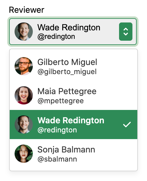
Anatomy#
A select consists of a label, a button which displays a selected value, and a listbox, displayed in a
popup. Users can click, touch, or use the keyboard on the button to open the listbox popup. useSelect
handles exposing the correct ARIA attributes for accessibility and handles the interactions for the
select in its collapsed state. It should be combined with useListBox, which handles
the implementation of the popup listbox.
useSelect also supports optional description and error message elements, which can be used
to provide more context about the field, and any validation messages. These are linked with the
input via the aria-describedby attribute.
useSelect returns props that you should spread onto the appropriate element:
| Name | Type | Description |
labelProps | HTMLAttributes<HTMLElement> | Props for the label element. |
triggerProps | AriaButtonProps | Props for the popup trigger element. |
valueProps | HTMLAttributes<HTMLElement> | Props for the element representing the selected value. |
menuProps | AriaListBoxOptions<unknown> | Props for the popup. |
descriptionProps | HTMLAttributes<HTMLElement> | Props for the select's description element, if any. |
errorMessageProps | HTMLAttributes<HTMLElement> | Props for the select's error message element, if any. |
State is managed by the useSelectState
hook from @react-stately/select. The state object should be passed as an option to useSelect
If a select does not have a visible label, an aria-label or aria-labelledby
prop must be passed instead to identify it to assistive technology.
State management#
useSelect requires knowledge of the options in the select in order to handle keyboard
navigation and other interactions. It does this using the Collection
interface, which is a generic interface to access sequential unique keyed data. You can
implement this interface yourself, e.g. by using a prop to pass a list of item objects,
but useSelectState from
@react-stately/select implements a JSX based interface for building collections instead.
See Collection Components for more information,
and Collection Interface for internal details.
In addition, useSelectState
manages the state necessary for multiple selection and exposes
a SelectionManager,
which makes use of the collection to provide an interface to update the selection state.
It also holds state to track if the popup is open.
For more information about selection, see Selection.
Example#
This example uses a <button> element for the trigger, with a <span> inside to hold the value,
and another for the dropdown arrow icon (hidden from screen readers with aria-hidden).
A <HiddenSelect> is used to render a hidden native
<select>, which enables browser form autofill support.
The listbox popup uses useListBox
and useOption to render the
list of options. In addition, a <FocusScope>
is used to automatically restore focus to the trigger
when the popup closes. A hidden <DismissButton>
is added at the start and end of the popup to allow screen reader users to dismiss the popup.
This example does not do any advanced popover positioning or portaling to escape its visual container.
See useOverlayTrigger for an example of how to implement this
using useOverlayPosition.
In addition, see useListBox for examples of sections (option groups), and more complex options. For an example of the description and error message elements, see useTextField.
import {HiddenSelect useSelect} from '@react-aria/select';
import {Item} from '@react-stately/collections';
import {useButton} from '@react-aria/button';
import {useSelectState} from '@react-stately/select';
// Reuse the ListBox and Popover from your component library. See below for details.
import {ListBox Popover} from 'your-component-library';
function Select(props) {
// Create state based on the incoming props
let state = useSelectState(props);
// Get props for child elements from useSelect
let ref = ReactuseRef();
let {labelProps triggerProps valueProps menuProps} = useSelect(
props
state
ref
);
// Get props for the button based on the trigger props from useSelect
let {buttonProps} = useButton(triggerProps ref);
return (
<div style={position: 'relative' display: 'inline-block'}>
<div ...labelProps>propslabel</div>
<HiddenSelect
state=state
triggerRef=ref
label=propslabel
name=propsname
/>
<button ...buttonProps ref=ref style={height: 30 fontSize: 14}>
<span ...valueProps>
stateselectedItem
? stateselectedItemrendered
: 'Select an option'
</span>
<span aria-hidden="true" style={paddingLeft: 5}>
▼
</span>
</button>
stateisOpen && (
<Popover isOpen=stateisOpen onClose=stateclose>
<ListBox ...menuProps state=state />
</Popover>
)
</div>
);
}
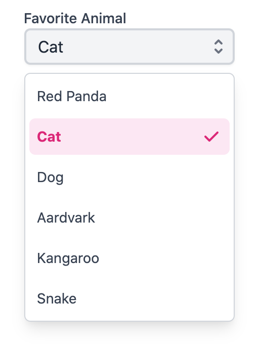
<Select label="Favorite Color">
<Item>Red</Item>
<Item>Orange</Item>
<Item>Yellow</Item>
<Item>Green</Item>
<Item>Blue</Item>
<Item>Purple</Item>
<Item>Black</Item>
<Item>White</Item>
<Item>Lime</Item>
<Item>Fushsia</Item>
</Select>import {HiddenSelect useSelect} from '@react-aria/select';
import {Item} from '@react-stately/collections';
import {useButton} from '@react-aria/button';
import {useSelectState} from '@react-stately/select';
// Reuse the ListBox and Popover from your component library. See below for details.
import {ListBox Popover} from 'your-component-library';
function Select(props) {
// Create state based on the incoming props
let state = useSelectState(props);
// Get props for child elements from useSelect
let ref = ReactuseRef();
let {
labelProps
triggerProps
valueProps
menuProps
} = useSelect(props state ref);
// Get props for the button based on the trigger props from useSelect
let {buttonProps} = useButton(triggerProps ref);
return (
<div
style={
position: 'relative'
display: 'inline-block'
}>
<div ...labelProps>propslabel</div>
<HiddenSelect
state=state
triggerRef=ref
label=propslabel
name=propsname
/>
<button
...buttonProps
ref=ref
style={height: 30 fontSize: 14}>
<span ...valueProps>
stateselectedItem
? stateselectedItemrendered
: 'Select an option'
</span>
<span aria-hidden="true" style={paddingLeft: 5}>
▼
</span>
</button>
stateisOpen && (
<Popover
isOpen=stateisOpen
onClose=stateclose>
<ListBox ...menuProps state=state />
</Popover>
)
</div>
);
}
<Select label="Favorite Color">
<Item>Red</Item>
<Item>Orange</Item>
<Item>Yellow</Item>
<Item>Green</Item>
<Item>Blue</Item>
<Item>Purple</Item>
<Item>Black</Item>
<Item>White</Item>
<Item>Lime</Item>
<Item>Fushsia</Item>
</Select>import {
HiddenSelect
useSelect
} from '@react-aria/select';
import {Item} from '@react-stately/collections';
import {useButton} from '@react-aria/button';
import {useSelectState} from '@react-stately/select';
// Reuse the ListBox and Popover from your component library. See below for details.
import {
ListBox
Popover
} from 'your-component-library';
function Select(props) {
// Create state based on the incoming props
let state = useSelectState(
props
);
// Get props for child elements from useSelect
let ref = ReactuseRef();
let {
labelProps
triggerProps
valueProps
menuProps
} = useSelect(
props
state
ref
);
// Get props for the button based on the trigger props from useSelect
let {
buttonProps
} = useButton(
triggerProps
ref
);
return (
<div
style={
position:
'relative'
display:
'inline-block'
}>
<div
...labelProps>
propslabel
</div>
<HiddenSelect
state=state
triggerRef=ref
label=
propslabel
name=propsname
/>
<button
...buttonProps
ref=ref
style={
height: 30
fontSize: 14
}>
<span
...valueProps>
stateselectedItem
? state
selectedItem
rendered
: 'Select an option'
</span>
<span
aria-hidden="true"
style={
paddingLeft: 5
}>
▼
</span>
</button>
stateisOpen && (
<Popover
isOpen=
stateisOpen
onClose=
stateclose
>
<ListBox
...menuProps
state=state
/>
</Popover>
)
</div>
);
}
<Select label="Favorite Color">
<Item>Red</Item>
<Item>Orange</Item>
<Item>Yellow</Item>
<Item>Green</Item>
<Item>Blue</Item>
<Item>Purple</Item>
<Item>Black</Item>
<Item>White</Item>
<Item>Lime</Item>
<Item>Fushsia</Item>
</Select>Popover#
The Popover component is used to contain the popup listbox for the Select.
It can be shared between many other components, including ComboBox,
Menu, Dialog, and others.
See useOverlayTrigger for more examples of popovers.
Show code
import {DismissButton useOverlay} from '@react-aria/overlays';
import {FocusScope} from '@react-aria/focus';
function Popover(props) {
let ref = ReactuseRef();
let {popoverRef = ref isOpen onClose children} = props;
// Handle events that should cause the popup to close,
// e.g. blur, clicking outside, or pressing the escape key.
let {overlayProps} = useOverlay(
{
isOpen
onClose
shouldCloseOnBlur: true
isDismissable: true
}
popoverRef
);
// Add a hidden <DismissButton> component at the end of the popover
// to allow screen reader users to dismiss the popup easily.
return (
<FocusScope restoreFocus>
<div
...overlayProps
ref=popoverRef
style={
position: 'absolute'
width: '100%'
border: '1px solid gray'
background: 'lightgray'
marginTop: 4
}>
children
<DismissButton onDismiss=onClose />
</div>
</FocusScope>
);
}
import {
DismissButton
useOverlay
} from '@react-aria/overlays';
import {FocusScope} from '@react-aria/focus';
function Popover(props) {
let ref = ReactuseRef();
let {
popoverRef = ref
isOpen
onClose
children
} = props;
// Handle events that should cause the popup to close,
// e.g. blur, clicking outside, or pressing the escape key.
let {
overlayProps
} = useOverlay(
{
isOpen
onClose
shouldCloseOnBlur: true
isDismissable: true
}
popoverRef
);
// Add a hidden <DismissButton> component at the end of the popover
// to allow screen reader users to dismiss the popup easily.
return (
<FocusScope
restoreFocus>
<div
...overlayProps
ref=popoverRef
style={
position:
'absolute'
width: '100%'
border:
'1px solid gray'
background:
'lightgray'
marginTop: 4
}>
children
<DismissButton
onDismiss=
onClose
/>
</div>
</FocusScope>
);
}
ListBox#
The ListBox and Option components are used to show the list of options.
They can also be shared with other components like a ComboBox. See
useListBox for more examples, including sections and more complex items.
Show code
import {useListBox useOption} from '@react-aria/listbox';
function ListBox(props) {
let ref = ReactuseRef();
let {listBoxRef = ref state} = props;
let {listBoxProps} = useListBox(props state listBoxRef);
return (
<ul
...listBoxProps
ref=listBoxRef
style={
margin: 0
padding: 0
listStyle: 'none'
maxHeight: '150px'
overflow: 'auto'
}>
[...statecollection]map((item) => (
<Option key=itemkey item=item state=state />
))
</ul>
);
}
function Option({item state}) {
let ref = ReactuseRef();
let {optionProps isSelected isFocused isDisabled} = useOption(
{key: itemkey}
state
ref
);
let backgroundColor;
let color = 'black';
if (isSelected) {
backgroundColor = 'blueviolet';
color = 'white';
} else if (isFocused) {
backgroundColor = 'gray';
} else if (isDisabled) {
backgroundColor = 'transparent';
color = 'gray';
}
return (
<li
...optionProps
ref=ref
style={
background: backgroundColor
color: color
padding: '2px 5px'
outline: 'none'
cursor: 'pointer'
}>
itemrendered
</li>
);
}
import {useListBox useOption} from '@react-aria/listbox';
function ListBox(props) {
let ref = ReactuseRef();
let {listBoxRef = ref state} = props;
let {listBoxProps} = useListBox(props state listBoxRef);
return (
<ul
...listBoxProps
ref=listBoxRef
style={
margin: 0
padding: 0
listStyle: 'none'
maxHeight: '150px'
overflow: 'auto'
}>
[...statecollection]map((item) => (
<Option key=itemkey item=item state=state />
))
</ul>
);
}
function Option({item state}) {
let ref = ReactuseRef();
let {
optionProps
isSelected
isFocused
isDisabled
} = useOption({key: itemkey} state ref);
let backgroundColor;
let color = 'black';
if (isSelected) {
backgroundColor = 'blueviolet';
color = 'white';
} else if (isFocused) {
backgroundColor = 'gray';
} else if (isDisabled) {
backgroundColor = 'transparent';
color = 'gray';
}
return (
<li
...optionProps
ref=ref
style={
background: backgroundColor
color: color
padding: '2px 5px'
outline: 'none'
cursor: 'pointer'
}>
itemrendered
</li>
);
}
import {
useListBox
useOption
} from '@react-aria/listbox';
function ListBox(props) {
let ref = ReactuseRef();
let {
listBoxRef = ref
state
} = props;
let {
listBoxProps
} = useListBox(
props
state
listBoxRef
);
return (
<ul
...listBoxProps
ref=listBoxRef
style={
margin: 0
padding: 0
listStyle:
'none'
maxHeight:
'150px'
overflow: 'auto'
}>
[
...statecollection
]map((item) => (
<Option
key=itemkey
item=item
state=state
/>
))
</ul>
);
}
function Option({
item
state
}) {
let ref = ReactuseRef();
let {
optionProps
isSelected
isFocused
isDisabled
} = useOption(
{key: itemkey}
state
ref
);
let backgroundColor;
let color = 'black';
if (isSelected) {
backgroundColor =
'blueviolet';
color = 'white';
} else if (isFocused) {
backgroundColor =
'gray';
} else if (
isDisabled
) {
backgroundColor =
'transparent';
color = 'gray';
}
return (
<li
...optionProps
ref=ref
style={
background: backgroundColor
color: color
padding:
'2px 5px'
outline: 'none'
cursor: 'pointer'
}>
itemrendered
</li>
);
}
Styled examples#
Internationalization#
useSelect and useListBox handle some aspects of internationalization automatically.
For example, type to select is implemented with an
Intl.Collator
for internationalized string matching. You are responsible for localizing all labels and option
content that is passed into the select.
RTL#
In right-to-left languages, the select should be mirrored. The arrow should be on the left, and the selected value should be on the right. In addition, the content of list options should flip. Ensure that your CSS accounts for this.
| Name | Type | Default | Description |
children | CollectionChildren<T> | — | The contents of the collection. |
keyboardDelegate | KeyboardDelegate | — | An optional keyboard delegate implementation for type to select, to override the default. |
name | string | — | The name of the input, used when submitting an HTML form. |
isOpen | boolean | — | Sets the open state of the menu. |
defaultOpen | boolean | — | Sets the default open state of the menu. |
onOpenChange | (
(isOpen: boolean
)) => void | — | Method that is called when the open state of the menu changes. |
shouldFlip | boolean | true | Whether the menu should automatically flip direction when space is limited. |
items | Iterable<T> | — | Item objects in the collection. |
disabledKeys | Iterable<Key> | — | The item keys that are disabled. These items cannot be selected, focused, or otherwise interacted with. |
isLoading | boolean | — | Whether the items are currently loading. |
onLoadMore | () => any | — | Handler that is called when more items should be loaded, e.g. while scrolling near the bottom. |
isDisabled | boolean | — | Whether the input is disabled. |
validationState | ValidationState | — | Whether the input should display its "valid" or "invalid" visual styling. |
isRequired | boolean | — | Whether user input is required on the input before form submission.
Often paired with the necessityIndicator prop to add a visual indicator to the input. |
description | ReactNode | — | A description for the field. Provides a hint such as specific requirements for what to choose. |
errorMessage | ReactNode | — | An error message for the field. |
label | ReactNode | — | The content to display as the label. |
placeholder | string | — | Temporary text that occupies the text input when it is empty. |
disallowEmptySelection | boolean | — | Whether the collection allows empty selection. |
selectedKey | Key | — | The currently selected key in the collection (controlled). |
defaultSelectedKey | Key | — | The initial selected key in the collection (uncontrolled). |
onSelectionChange | (
(key: Key
)) => any | — | Handler that is called when the selection changes. |
autoFocus | boolean | — | Whether the element should receive focus on render. |
onFocus | (
(e: FocusEvent
)) => void | — | Handler that is called when the element receives focus. |
onBlur | (
(e: FocusEvent
)) => void | — | Handler that is called when the element loses focus. |
onFocusChange | (
(isFocused: boolean
)) => void | — | Handler that is called when the element's focus status changes. |
onKeyDown | (
(e: KeyboardEvent
)) => void | — | Handler that is called when a key is pressed. |
onKeyUp | (
(e: KeyboardEvent
)) => void | — | Handler that is called when a key is released. |
id | string | — | The element's unique identifier. See MDN. |
aria-label | string | — | Defines a string value that labels the current element. |
aria-labelledby | string | — | Identifies the element (or elements) that labels the current element. |
aria-describedby | string | — | Identifies the element (or elements) that describes the object. |
aria-details | string | — | Identifies the element (or elements) that provide a detailed, extended description for the object. |
excludeFromTabOrder | boolean | — | Whether to exclude the element from the sequential tab order. If true, the element will not be focusable via the keyboard by tabbing. This should be avoided except in rare scenarios where an alternative means of accessing the element or its functionality via the keyboard is available. |
Properties
| Name | Type | Description |
isFocused | boolean | Whether the select is currently focused. |
selectedKey | Key | The key for the currently selected item. |
selectedItem | Node<T> | The value of the currently selected item. |
collection | Collection<Node<T>> | A collection of items in the list. |
disabledKeys | Set<Key> | A set of items that are disabled. |
selectionManager | SelectionManager | A selection manager to read and update multiple selection state. |
focusStrategy | FocusStrategy | Controls which item will be auto focused when the menu opens. |
isOpen | boolean | Whether the overlay is currently open. |
Methods
| Method | Description |
setFocused(
  (isFocused: boolean
)): void | Sets whether the select is focused. |
setSelectedKey(
  (key: Key
)): void | Sets the selected key. |
open(
  (focusStrategy: FocusStrategy
    |  | null
)): void | Opens the menu. |
toggle(
  (focusStrategy: FocusStrategy
    |  | null
)): void | Toggles the menu. |
close(): void | Closes the overlay. |
An interface for reading and updating multiple selection state.
Properties
| Name | Type | Description |
selectionMode | SelectionMode | The type of selection that is allowed in the collection. |
disallowEmptySelection | boolean | Whether the collection allows empty selection. |
selectionBehavior | SelectionBehavior | The selection behavior for the collection. |
isFocused | boolean | Whether the collection is currently focused. |
focusedKey | Key | The current focused key in the collection. |
childFocusStrategy | FocusStrategy | Whether the first or last child of the focused key should receive focus. |
selectedKeys | Set<Key> | The currently selected keys in the collection. |
rawSelection | Selection | The raw selection value for the collection. Either 'all' for select all, or a set of keys. |
isEmpty | boolean | Whether the selection is empty. |
isSelectAll | boolean | Whether all items in the collection are selected. |
firstSelectedKey | Key | null | |
lastSelectedKey | Key | null |
Methods
| Method | Description |
setSelectionBehavior(
  (selectionBehavior: SelectionBehavior
)): void | Sets the selection behavior for the collection. |
setFocused(
  (isFocused: boolean
)): void | Sets whether the collection is focused. |
setFocusedKey(
  (key: Key,
  , childFocusStrategy: FocusStrategy
)): void | Sets the focused key. |
isSelected(
  (key: Key
)): void | Returns whether a key is selected. |
extendSelection(
  (toKey: Key
)): void | Extends the selection to the given key. |
toggleSelection(
  (key: Key
)): void | Toggles whether the given key is selected. |
replaceSelection(
  (key: Key
)): void | Replaces the selection with only the given key. |
setSelectedKeys(
  (keys: Iterable<Key>
)): void | Replaces the selection with the given keys. |
selectAll(): void | Selects all items in the collection. |
clearSelection(): void | Removes all keys from the selection. |
toggleSelectAll(): void | Toggles between select all and an empty selection. |
select(
  (key: Key,
  , e: PressEvent
  | LongPressEvent
  | PointerEvent
)): void | |
isSelectionEqual(
  (selection: Set<Key>
)): void | Returns whether the current selection is equal to the given selection. |
canSelectItem(
  (key: Key
)): void |
Properties
| Name | Type | Description |
selectionMode | SelectionMode | The type of selection that is allowed in the collection. |
selectionBehavior | SelectionBehavior | The selection behavior for the collection. |
disallowEmptySelection | boolean | Whether the collection allows empty selection. |
selectedKeys | Selection | The currently selected keys in the collection. |
disabledKeys | Set<Key> | The currently disabled keys in the collection. |
isFocused | boolean | Whether the collection is currently focused. |
focusedKey | Key | The current focused key in the collection. |
childFocusStrategy | FocusStrategy | Whether the first or last child of the focused key should receive focus. |
Methods
| Method | Description |
setSelectionBehavior(
  (selectionBehavior: SelectionBehavior
)): void | Sets the selection behavior for the collection. |
setSelectedKeys(
  (keys: Selection
    |  | (
      (v: Selection
    )) => Selection
)): void | Sets the selected keys in the collection. |
setFocused(
  (isFocused: boolean
)): void | Sets whether the collection is focused. |
setFocusedKey(
  (key: Key,
  , child: FocusStrategy
)): void | Sets the focused key, and optionally, whether the first or last child of that key should receive focus. |
| Name | Type | Description |
labelProps | HTMLAttributes<HTMLElement> | Props for the label element. |
triggerProps | AriaButtonProps | Props for the popup trigger element. |
valueProps | HTMLAttributes<HTMLElement> | Props for the element representing the selected value. |
menuProps | AriaListBoxOptions<unknown> | Props for the popup. |
descriptionProps | HTMLAttributes<HTMLElement> | Props for the select's description element, if any. |
errorMessageProps | HTMLAttributes<HTMLElement> | Props for the select's error message element, if any. |
| Name | Type | Description |
isVirtualized | boolean | Whether the listbox uses virtual scrolling. |
keyboardDelegate | KeyboardDelegate | An optional keyboard delegate implementation for type to select, to override the default. |
shouldUseVirtualFocus | boolean | Whether the listbox items should use virtual focus instead of being focused directly. |
shouldSelectOnPressUp | boolean | Whether selection should occur on press up instead of press down. |
shouldFocusOnHover | boolean | Whether options should be focused when the user hovers over them. |
label | ReactNode | An optional visual label for the listbox. |
autoFocus | boolean | FocusStrategy | Whether to auto focus the listbox or an option. |
shouldFocusWrap | boolean | Whether focus should wrap around when the end/start is reached. |
items | Iterable<T> | Item objects in the collection. |
disabledKeys | Iterable<Key> | The item keys that are disabled. These items cannot be selected, focused, or otherwise interacted with. |
selectionMode | SelectionMode | The type of selection that is allowed in the collection. |
disallowEmptySelection | boolean | Whether the collection allows empty selection. |
selectedKeys | 'all' | Iterable<Key> | The currently selected keys in the collection (controlled). |
defaultSelectedKeys | 'all' | Iterable<Key> | The initial selected keys in the collection (uncontrolled). |
onSelectionChange | (
(keys: Selection
)) => any | Handler that is called when the selection changes. |
onFocus | (
(e: FocusEvent
)) => void | Handler that is called when the element receives focus. |
onBlur | (
(e: FocusEvent
)) => void | Handler that is called when the element loses focus. |
onFocusChange | (
(isFocused: boolean
)) => void | Handler that is called when the element's focus status changes. |
id | string | The element's unique identifier. See MDN. |
aria-label | string | Defines a string value that labels the current element. |
aria-labelledby | string | Identifies the element (or elements) that labels the current element. |
aria-describedby | string | Identifies the element (or elements) that describes the object. |
aria-details | string | Identifies the element (or elements) that provide a detailed, extended description for the object. |
Provides state management for a select component. Handles building a collection of items from props, handles the open state for the popup menu, and manages multiple selection state.
useSelectState<T>(
  (props: SelectProps<T>
)): SelectState<T>| Name | Type | Default | Description |
children | CollectionChildren<T> | — | The contents of the collection. |
isOpen | boolean | — | Sets the open state of the menu. |
defaultOpen | boolean | — | Sets the default open state of the menu. |
onOpenChange | (
(isOpen: boolean
)) => void | — | Method that is called when the open state of the menu changes. |
shouldFlip | boolean | true | Whether the menu should automatically flip direction when space is limited. |
items | Iterable<T> | — | Item objects in the collection. |
disabledKeys | Iterable<Key> | — | The item keys that are disabled. These items cannot be selected, focused, or otherwise interacted with. |
isLoading | boolean | — | Whether the items are currently loading. |
onLoadMore | () => any | — | Handler that is called when more items should be loaded, e.g. while scrolling near the bottom. |
isDisabled | boolean | — | Whether the input is disabled. |
validationState | ValidationState | — | Whether the input should display its "valid" or "invalid" visual styling. |
isRequired | boolean | — | Whether user input is required on the input before form submission.
Often paired with the necessityIndicator prop to add a visual indicator to the input. |
description | ReactNode | — | A description for the field. Provides a hint such as specific requirements for what to choose. |
errorMessage | ReactNode | — | An error message for the field. |
label | ReactNode | — | The content to display as the label. |
placeholder | string | — | Temporary text that occupies the text input when it is empty. |
disallowEmptySelection | boolean | — | Whether the collection allows empty selection. |
selectedKey | Key | — | The currently selected key in the collection (controlled). |
defaultSelectedKey | Key | — | The initial selected key in the collection (uncontrolled). |
onSelectionChange | (
(key: Key
)) => any | — | Handler that is called when the selection changes. |
autoFocus | boolean | — | Whether the element should receive focus on render. |
onFocus | (
(e: FocusEvent
)) => void | — | Handler that is called when the element receives focus. |
onBlur | (
(e: FocusEvent
)) => void | — | Handler that is called when the element loses focus. |
onFocusChange | (
(isFocused: boolean
)) => void | — | Handler that is called when the element's focus status changes. |
onKeyDown | (
(e: KeyboardEvent
)) => void | — | Handler that is called when a key is pressed. |
onKeyUp | (
(e: KeyboardEvent
)) => void | — | Handler that is called when a key is released. |
Renders a hidden native <select> element, which can be used to support browser
form autofill, mobile form navigation, and native form submission.
| Name | Type | Description |
state | SelectState<T> | State for the select. |
triggerRef | RefObject<HTMLElement> | A ref to the trigger element. |
label | ReactNode | The text label for the select. |
name | string | HTML form input name. |
isDisabled | boolean | Sets the disabled state of the select and input. |
Provides the behavior and accessibility implementation for a listbox component. A listbox displays a list of options and allows a user to select one or more of them.
useListBox<T>(
  props: AriaListBoxOptions<T>,
  state: ListState<T>,
  ref: RefObject<HTMLElement>
): ListBoxAria| Name | Type | Description |
collection | Collection<Node<T>> | A collection of items in the list. |
disabledKeys | Set<Key> | A set of items that are disabled. |
selectionManager | SelectionManager | A selection manager to read and update multiple selection state. |
| Name | Type | Description |
listBoxProps | HTMLAttributes<HTMLElement> | Props for the listbox element. |
labelProps | HTMLAttributes<HTMLElement> | Props for the listbox's visual label element (if any). |
Provides the behavior and accessibility implementation for an option in a listbox.
See useListBox for more details about listboxes.
useOption<T>(
  props: AriaOptionProps,
  state: ListState<T>,
  ref: RefObject<HTMLElement>
): OptionAria| Name | Type | Description |
key | Key | The unique key for the option. |
aria-label | string | A screen reader only label for the option. |
| Name | Type | Description |
optionProps | HTMLAttributes<HTMLElement> | Props for the option element. |
labelProps | HTMLAttributes<HTMLElement> | Props for the main text element inside the option. |
descriptionProps | HTMLAttributes<HTMLElement> | Props for the description text element inside the option, if any. |
isFocused | boolean | Whether the option is currently focused. |
isSelected | boolean | Whether the option is currently selected. |
isPressed | boolean | Whether the option is currently in a pressed state. |
isDisabled | boolean | Whether the option is disabled. |
A FocusScope manages focus for its descendants. It supports containing focus inside the scope, restoring focus to the previously focused element on unmount, and auto focusing children on mount. It also acts as a container for a programmatic focus management interface that can be used to move focus forward and back in response to user events.
| Name | Type | Description |
children | ReactNode | The contents of the focus scope. |
contain | boolean | Whether to contain focus inside the scope, so users cannot move focus outside, for example in a modal dialog. |
restoreFocus | boolean | Whether to restore focus back to the element that was focused when the focus scope mounted, after the focus scope unmounts. |
autoFocus | boolean | Whether to auto focus the first focusable element in the focus scope on mount. |
A visually hidden button that can be used to allow screen reader users to dismiss a modal or popup when there is no visual affordance to do so.
| Name | Type | Description |
onDismiss | () => void | Called when the dismiss button is activated. |
Handles positioning overlays like popovers and menus relative to a trigger element, and updating the position when the window resizes.
useOverlayPosition(
  (props: AriaPositionProps
)): PositionAria| Name | Type | Default | Description |
targetRef | RefObject<HTMLElement> | — | The ref for the element which the overlay positions itself with respect to. |
overlayRef | RefObject<HTMLElement> | — | The ref for the overlay element. |
boundaryElement | HTMLElement | document.body | Element that that serves as the positioning boundary. |
scrollRef | RefObject<HTMLElement> | overlayRef | A ref for the scrollable region within the overlay. |
shouldUpdatePosition | boolean | true | Whether the overlay should update its position automatically. |
onClose | () => void | — | Handler that is called when the overlay should close. |
placement | Placement | 'bottom' | The placement of the element with respect to its anchor element. |
containerPadding | number | 12 | The placement padding that should be applied between the element and its surrounding container. |
offset | number | 0 | The additional offset applied along the main axis between the element and its anchor element. |
crossOffset | number | 0 | The additional offset applied along the cross axis between the element and its anchor element. |
shouldFlip | boolean | true | Whether the element should flip its orientation (e.g. top to bottom or left to right) when there is insufficient room for it to render completely. |
isOpen | boolean | — | Whether the element is rendered. |
'bottom'
  | 'bottom left'
  | 'bottom right'
  | 'bottom start'
  | 'bottom end'
  | 'top'
  | 'top left'
  | 'top right'
  | 'top start'
  | 'top end'
  | 'left'
  | 'left top'
  | 'left bottom'
  | 'start'
  | 'start top'
  | 'start bottom'
  | 'right'
  | 'right top'
  | 'right bottom'
  | 'end'
  | 'end top'
  | 'end bottom'
Properties
| Name | Type | Description |
overlayProps | HTMLAttributes<Element> | Props for the overlay container element. |
arrowProps | HTMLAttributes<Element> | Props for the overlay tip arrow if any. |
placement | PlacementAxis | Placement of the overlay with respect to the overlay trigger. |
Methods
| Method | Description |
updatePosition(): void | Updates the position of the overlay. |
Axis | 'center''top'
| 'bottom'
| 'left'
| 'right'