Dialog
A dialog is an overlay shown above other content in an application.
| install | yarn add react-aria-components |
|---|---|
| version | 1.4.1 |
| usage | import {Dialog} from 'react-aria-components' |
Example#
import {Button, Dialog, DialogTrigger, Heading, Input, Label, Modal, TextField} from 'react-aria-components';

<DialogTrigger>
  <Button>Sign up…</Button>
  <Modal>
    <Dialog>
      <form>
        <Heading slot="title">Sign up</Heading>
        <TextField autoFocus>
          <Label>First Name</Label>
          <Input />
        </TextField>
        <TextField>
          <Label>Last Name</Label>
          <Input />
        </TextField>
        <Button slot="close" style={{ marginTop: 8 }}>
          Submit
        </Button>
      </form>
    </Dialog>
  </Modal>
</DialogTrigger>
import {
Button,
Dialog,
DialogTrigger,
Heading,
Input,
Label,
Modal,
TextField
} from 'react-aria-components';
<DialogTrigger>
<Button>
Sign up…
</Button>
<Modal>
<Dialog>
<form>
<Heading slot="title">
Sign up
</Heading>
<TextField
autoFocus
>
<Label>
First Name
</Label>
<Input />
</TextField>
<TextField>
<Label>
Last Name
</Label>
<Input />
</TextField>
<Button
slot="close"
style={{
marginTop:
8
}}
>
Submit
</Button>
</form>
</Dialog>
</Modal>
</DialogTrigger>Show CSS
.react-aria-Dialog {
  outline: none;
  padding: 30px;
  max-height: inherit;
  box-sizing: border-box;
  overflow: auto;

  .react-aria-Heading[slot=title] {
    line-height: 1em;
    margin-top: 0;
  }
}.react-aria-Dialog {
outline: none;
padding: 30px;
max-height: inherit;
box-sizing: border-box;
overflow: auto;
.react-aria-Heading[slot=title] {
line-height: 1em;
margin-top: 0;
}
}.react-aria-Dialog {
outline: none;
padding: 30px;
max-height: inherit;
box-sizing: border-box;
overflow: auto;
.react-aria-Heading[slot=title] {
line-height: 1em;
margin-top: 0;
}
}Features#
The HTML <dialog> element
can be used to build dialogs. However, it is not yet widely supported across browsers, and
building fully accessible custom dialogs from scratch is very difficult and error prone.
Dialog helps achieve accessible dialogs that can be styled as needed.
- Flexible – Dialogs can be used within a Modal or Popover to create many types of overlay elements.
- Accessible – Exposed to assistive technology as a
dialogoralertdialogwith ARIA. The dialog is automatically labeled by a nested<Heading>element. Content outside the dialog is hidden from assistive technologies while it is open. - Focus management – Focus is moved into the dialog on mount, and restored to the trigger element on unmount. While open, focus is contained within the dialog, preventing the user from tabbing outside.
Anatomy#
A dialog consists of a container element and an optional title and close button. It can be placed within a Modal or Popover, to create modal dialogs, popovers, and other types of overlays. A DialogTrigger can be used to open a dialog overlay in response to a user action, e.g. clicking a button.
import {Button, Dialog, DialogTrigger, Heading, Modal} from 'react-aria-components';

<DialogTrigger>
  <Button />
  <Modal>
    <Dialog>
      <Heading slot="title" />
      <Button slot="close" />
    </Dialog>
  </Modal>
</DialogTrigger>
import {
Button,
Dialog,
DialogTrigger,
Heading,
Modal
} from 'react-aria-components';
<DialogTrigger>
<Button />
<Modal>
<Dialog>
<Heading slot="title" />
<Button slot="close" />
</Dialog>
</Modal>
</DialogTrigger>import {
Button,
Dialog,
DialogTrigger,
Heading,
Modal
} from 'react-aria-components';
<DialogTrigger>
<Button />
<Modal>
<Dialog>
<Heading slot="title" />
<Button slot="close" />
</Dialog>
</Modal>
</DialogTrigger>If a dialog does not have a visible heading element, an aria-label or aria-labelledby prop must be passed instead to identify the element to assistive technology.
Examples#


Starter kits#
To help kick-start your project, we offer starter kits that include example implementations of all React Aria components with various styling solutions. All components are fully styled, including support for dark mode, high contrast mode, and all UI states. Each starter comes with a pre-configured Storybook that you can experiment with, or use as a starting point for your own component library.
Popover#
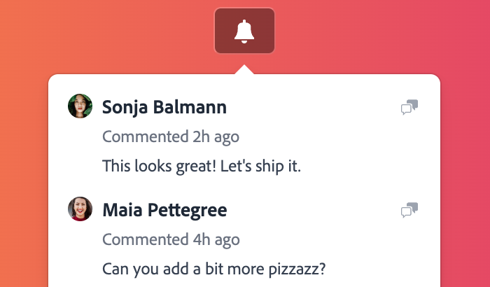
A Dialog may be placed within a Popover to display it in context with a trigger element.
import {OverlayArrow, Popover} from 'react-aria-components';

<DialogTrigger>
  <Button aria-label="Help">ⓘ</Button>
  <Popover>
    <OverlayArrow>
      <svg width={12} height={12} viewBox="0 0 12 12">
        <path d="M0 0 L6 6 L12 0" />
      </svg>
    </OverlayArrow>
    <Dialog>
      <Heading slot="title">Help</Heading>
      <p>For help accessing your account, please contact support.</p>
    </Dialog>
  </Popover>
</DialogTrigger>
import {OverlayArrow, Popover} from 'react-aria-components';
<DialogTrigger>
<Button aria-label="Help">ⓘ</Button>
<Popover>
<OverlayArrow>
<svg width={12} height={12} viewBox="0 0 12 12">
<path d="M0 0 L6 6 L12 0" />
</svg>
</OverlayArrow>
<Dialog>
<Heading slot="title">Help</Heading>
<p>
For help accessing your account, please contact
support.
</p>
</Dialog>
</Popover>
</DialogTrigger>import {
OverlayArrow,
Popover
} from 'react-aria-components';
<DialogTrigger>
<Button aria-label="Help">
ⓘ
</Button>
<Popover>
<OverlayArrow>
<svg
width={12}
height={12}
viewBox="0 0 12 12"
>
<path d="M0 0 L6 6 L12 0" />
</svg>
</OverlayArrow>
<Dialog>
<Heading slot="title">
Help
</Heading>
<p>
For help
accessing your
account, please
contact
support.
</p>
</Dialog>
</Popover>
</DialogTrigger>Alert dialog#
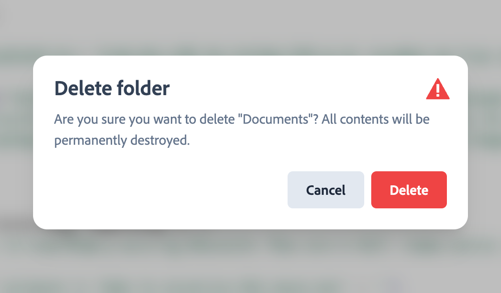
Alert dialogs are a special type of dialog meant to present a prompt that the user must confirm before an action proceeds. An alert dialog may also behave differently with assistive technologies, such as playing a system alert sound when opening. Use the role="alertdialog" prop on the <Dialog> element to make an alert dialog.
<DialogTrigger>
  <Button>Delete…</Button>
  <Modal>
    <Dialog role="alertdialog">
      {({close}) => (
        <>
          <Heading slot="title">Delete file</Heading>
          <p>This will permanently delete the selected file. Continue?</p>
          <div style={{display: 'flex', gap: 8}}>
            <Button onPress={close}>Cancel</Button>
            <Button onPress={close}>Delete</Button>
          </div>
        </>
      )}
    </Dialog>
  </Modal>
</DialogTrigger><DialogTrigger>
<Button>Delete…</Button>
<Modal>
<Dialog role="alertdialog">
{({ close }) => (
<>
<Heading slot="title">Delete file</Heading>
<p>
This will permanently delete the selected
file. Continue?
</p>
<div style={{ display: 'flex', gap: 8 }}>
<Button onPress={close}>Cancel</Button>
<Button onPress={close}>Delete</Button>
</div>
</>
)}
</Dialog>
</Modal>
</DialogTrigger><DialogTrigger>
<Button>
Delete…
</Button>
<Modal>
<Dialog role="alertdialog">
{({ close }) => (
<>
<Heading slot="title">
Delete file
</Heading>
<p>
This will
permanently
delete the
selected
file.
Continue?
</p>
<div
style={{
display:
'flex',
gap: 8
}}
>
<Button
onPress={close}
>
Cancel
</Button>
<Button
onPress={close}
>
Delete
</Button>
</div>
</>
)}
</Dialog>
</Modal>
</DialogTrigger>Props#
DialogTrigger#
| Name | Type | Description |
children | ReactNode | |
isOpen | boolean | Whether the overlay is open by default (controlled). |
defaultOpen | boolean | Whether the overlay is open by default (uncontrolled). |
Events
| Name | Type | Description |
onOpenChange | (
(isOpen: boolean
)) => void | Handler that is called when the overlay's open state changes. |
Dialog#
| Name | Type | Description |
children | ReactNode | (
(opts: DialogRenderProps
)) => ReactNode | Children of the dialog. A function may be provided to access a function to close the dialog. |
className | string | The CSS className for the element. |
style | CSSProperties | The inline style for the element. |
Layout
| Name | Type | Description |
slot | string | null | A slot name for the component. Slots allow the component to receive props from a parent component.
An explicit |
Accessibility
| Name | Type | Default | Description |
role | 'dialog' | 'alertdialog' | 'dialog' | The accessibility role for the dialog. |
id | string | — | The element's unique identifier. See MDN. |
aria-label | string | — | Defines a string value that labels the current element. |
aria-labelledby | string | — | Identifies the element (or elements) that labels the current element. |
aria-describedby | string | — | Identifies the element (or elements) that describes the object. |
aria-details | string | — | Identifies the element (or elements) that provide a detailed, extended description for the object. |
Heading#
A <Heading> accepts all HTML attributes.
Button#
A <Button slot="close"> element can be placed inside a <Dialog> to close it when pressed.
Show props
| Name | Type | Default | Description |
form | string | — | The |
formAction | string | — | The URL that processes the information submitted by the button. Overrides the action attribute of the button's form owner. |
formEncType | string | — | Indicates how to encode the form data that is submitted. |
formMethod | string | — | Indicates the HTTP method used to submit the form. |
formNoValidate | boolean | — | Indicates that the form is not to be validated when it is submitted. |
formTarget | string | — | Overrides the target attribute of the button's form owner. |
name | string | — | Submitted as a pair with the button's value as part of the form data. |
value | string | — | The value associated with the button's name when it's submitted with the form data. |
isPending | boolean | — | Whether the button is in a pending state. This disables press and hover events while retaining focusability, and announces the pending state to screen readers. |
isDisabled | boolean | — | Whether the button is disabled. |
autoFocus | boolean | — | Whether the element should receive focus on render. |
type | 'button'
| 'submit'
| 'reset' | 'button' | The behavior of the button when used in an HTML form. |
children | ReactNode | (
(values: ButtonRenderProps
& & {}
)) => ReactNode | — | The children of the component. A function may be provided to alter the children based on component state. |
className | string | (
(values: ButtonRenderProps
& & {}
)) => string | — | The CSS className for the element. A function may be provided to compute the class based on component state. |
style | CSSProperties | (
(values: ButtonRenderProps
& & {}
)) => CSSProperties | undefined | — | The inline style for the element. A function may be provided to compute the style based on component state. |
Events
| Name | Type | Description |
onPress | (
(e: PressEvent
)) => void | Handler that is called when the press is released over the target. |
onPressStart | (
(e: PressEvent
)) => void | Handler that is called when a press interaction starts. |
onPressEnd | (
(e: PressEvent
)) => void | Handler that is called when a press interaction ends, either over the target or when the pointer leaves the target. |
onPressChange | (
(isPressed: boolean
)) => void | Handler that is called when the press state changes. |
onPressUp | (
(e: PressEvent
)) => void | Handler that is called when a press is released over the target, regardless of whether it started on the target or not. |
onFocus | (
(e: FocusEvent<Target>
)) => void | Handler that is called when the element receives focus. |
onBlur | (
(e: FocusEvent<Target>
)) => void | Handler that is called when the element loses focus. |
onFocusChange | (
(isFocused: boolean
)) => void | Handler that is called when the element's focus status changes. |
onKeyDown | (
(e: KeyboardEvent
)) => void | Handler that is called when a key is pressed. |
onKeyUp | (
(e: KeyboardEvent
)) => void | Handler that is called when a key is released. |
onHoverStart | (
(e: HoverEvent
)) => void | Handler that is called when a hover interaction starts. |
onHoverEnd | (
(e: HoverEvent
)) => void | Handler that is called when a hover interaction ends. |
onHoverChange | (
(isHovering: boolean
)) => void | Handler that is called when the hover state changes. |
Layout
| Name | Type | Description |
slot | string | null | A slot name for the component. Slots allow the component to receive props from a parent component.
An explicit |
Accessibility
| Name | Type | Description |
id | string | The element's unique identifier. See MDN. |
excludeFromTabOrder | boolean | Whether to exclude the element from the sequential tab order. If true, the element will not be focusable via the keyboard by tabbing. This should be avoided except in rare scenarios where an alternative means of accessing the element or its functionality via the keyboard is available. |
preventFocusOnPress | boolean | Whether to prevent focus from moving to the button when pressing it. Caution, this can make the button inaccessible and should only be used when alternative keyboard interaction is provided, such as ComboBox's MenuTrigger or a NumberField's increment/decrement control. |
aria-expanded | boolean
| 'true'
| 'false' | Indicates whether the element, or another grouping element it controls, is currently expanded or collapsed. |
aria-haspopup | boolean
| 'menu'
| 'listbox'
| 'tree'
| 'grid'
| 'dialog'
| 'true'
| 'false' | Indicates the availability and type of interactive popup element, such as menu or dialog, that can be triggered by an element. |
aria-controls | string | Identifies the element (or elements) whose contents or presence are controlled by the current element. |
aria-pressed | boolean
| 'true'
| 'false'
| 'mixed' | Indicates the current "pressed" state of toggle buttons. |
aria-label | string | Defines a string value that labels the current element. |
aria-labelledby | string | Identifies the element (or elements) that labels the current element. |
aria-describedby | string | Identifies the element (or elements) that describes the object. |
aria-details | string | Identifies the element (or elements) that provide a detailed, extended description for the object. |
Styling#
React Aria components can be styled in many ways, including using CSS classes, inline styles, utility classes (e.g. Tailwind), CSS-in-JS (e.g. Styled Components), etc. By default, all components include a builtin className attribute which can be targeted using CSS selectors. These follow the react-aria-ComponentName naming convention.
.react-aria-Dialog {
  /* ... */
}.react-aria-Dialog {
/* ... */
}.react-aria-Dialog {
/* ... */
}A custom className can also be specified on any component. This overrides the default className provided by React Aria with your own.
<Dialog className="my-dialog">
  {/* ... */}
</Dialog><Dialog className="my-dialog">
{/* ... */}
</Dialog><Dialog className="my-dialog">
{/* ... */}
</Dialog>The selectors for each component used in a Dialog are documented below.
DialogTrigger#
The DialogTrigger component does not render any DOM elements (it only passes through its children) so it does not support styling. If you need a wrapper element, add one yourself inside the <DialogTrigger>.
<DialogTrigger>
  <div className="my-dialog-trigger">
    {/* ... */}
  </div>
</DialogTrigger><DialogTrigger>
<div className="my-dialog-trigger">
{/* ... */}
</div>
</DialogTrigger><DialogTrigger>
<div className="my-dialog-trigger">
{/* ... */}
</div>
</DialogTrigger>Dialog#
A Dialog can be targeted with the .react-aria-Dialog CSS selector, or by overriding with a custom className.
Heading#
A Heading can be targeted with the .react-aria-Heading CSS selector, or by overriding with a custom className.
Advanced customization#
Custom children#
DialogTrigger and Dialog pass props to their child components, such as the trigger button and modal overlay, via their associated contexts. These contexts are exported so you can also consume them in your own custom components. This enables you to reuse existing components from your app or component library together with React Aria Components.
| Component | Context | Props | Ref |
Button | ButtonContext | ButtonProps | HTMLButtonElement |
Dialog | DialogContext | DialogProps | HTMLElement |
Modal | ModalContext | ModalOverlayProps | HTMLDivElement |
Popover | PopoverContext | PopoverProps | HTMLElement |
Heading | HeadingContext | HeadingProps | HTMLHeadingElement |
This example consumes from HeadingContext in an existing styled heading component to make it compatible with React Aria Components. The useContextProps hook merges the local props and ref with the ones provided via context by Dialog.
import type {HeadingProps} from 'react-aria-components';
import {HeadingContext, useContextProps} from 'react-aria-components';

const MyCustomHeading = React.forwardRef(
  (props: HeadingProps, ref: React.ForwardedRef<HTMLHeadingElement>) => {
    // Merge the local props and ref with the ones provided via context.
    [props, ref] = useContextProps(props, ref, HeadingContext);
    // ... your existing Heading component
    return <h2 {...props} ref={ref} />;
  }
);
import type {HeadingProps} from 'react-aria-components';
import {
  HeadingContext,
  useContextProps
} from 'react-aria-components';

const MyCustomHeading = React.forwardRef(
  (
    props: HeadingProps,
    ref: React.ForwardedRef<HTMLHeadingElement>
  ) => {
    // Merge the local props and ref with the ones provided via context.
    [props, ref] = useContextProps(
      props,
      ref,
      HeadingContext
    );
    // ... your existing Heading component
    return <h2 {...props} ref={ref} />;
  }
);
import type {HeadingProps} from 'react-aria-components';
import {
  HeadingContext,
  useContextProps
} from 'react-aria-components';

const MyCustomHeading =
  React.forwardRef(
    (
      props:
        HeadingProps,
      ref:
        React.ForwardedRef<
          HTMLHeadingElement
        >
    ) => {
      // Merge the local props and ref with the ones provided via context.
      [props, ref] =
        useContextProps(
          props,
          ref,
          HeadingContext
        );
      // ... your existing Heading component
      return (
        <h2
          {...props}
          ref={ref}
        />
      );
    }
  );
Now you can use MyCustomHeading within a Dialog, in place of the builtin React Aria Components Heading.
<Dialog>
  <MyCustomHeading>Dialog title</MyCustomHeading>  {/* ... */}
</Dialog><Dialog>
<MyCustomHeading>Dialog title</MyCustomHeading> {/* ... */}
</Dialog><Dialog>
<MyCustomHeading>
Dialog title
</MyCustomHeading> {/* ... */}
</Dialog>State#
DialogTrigger provides an OverlayTriggerState object to its children via OverlayTriggerStateContext. This can be used to access and manipulate the dialog trigger's state.
This example shows a CloseButton component that can be placed within a DialogTrigger to close the overlay.
import {OverlayTriggerStateContext} from 'react-aria-components';

function CloseButton() {
  let state = React.useContext(OverlayTriggerStateContext)!;  return <Button onPress={() => state.close()}>Close</Button>;
}

<DialogTrigger>
  <Button>About</Button>
  <Modal isDismissable>
    <Dialog>
      <Heading slot="title">About</Heading>
      <p>Copyright © 2023 Adobe. All rights reserved.</p>
      <CloseButton />    </Dialog>
  </Modal>
</DialogTrigger>
import {OverlayTriggerStateContext} from 'react-aria-components';
function CloseButton() {
let state = React.useContext(OverlayTriggerStateContext)!; return (
<Button onPress={() => state.close()}>Close</Button>
);
}
<DialogTrigger>
<Button>About</Button>
<Modal isDismissable>
<Dialog>
<Heading slot="title">About</Heading>
<p>Copyright © 2023 Adobe. All rights reserved.</p>
<CloseButton /> </Dialog>
</Modal>
</DialogTrigger>import {OverlayTriggerStateContext} from 'react-aria-components';
function CloseButton() {
let state = React
.useContext(
OverlayTriggerStateContext
)!; return (
<Button
onPress={() =>
state.close()}
>
Close
</Button>
);
}
<DialogTrigger>
<Button>
About
</Button>
<Modal isDismissable>
<Dialog>
<Heading slot="title">
About
</Heading>
<p>
Copyright ©
2023 Adobe. All
rights
reserved.
</p>
<CloseButton /> </Dialog>
</Modal>
</DialogTrigger>Hooks#
If you need to customize things further, such as accessing internal state or customizing DOM structure, you can drop down to the lower level Hook-based API. See useDialog for more details.