useSelect
Provides the behavior and accessibility implementation for a select component. A select displays a collapsible list of options and allows a user to select one of them.
| install | yarn add react-aria |
|---|---|
| version | 3.19.0 |
| usage | import {useSelect} from 'react-aria' |
API#
useSelect<T>(
  props: AriaSelectOptions<T>,
  state: SelectState<T>,
  ref: RefObject<FocusableElement>
): SelectAria<T>
Features#
A select can be built using the <select>
and <option> HTML elements, but this is
not possible to style consistently cross browser, especially the options. useSelect helps achieve accessible
select components that can be styled as needed without compromising on high quality interactions.
- Exposed to assistive technology as a button with a
listboxpopup using ARIA (combined with useListBox) - Support for selecting a single option
- Support for disabled options
- Support for sections
- Labeling support for accessibility
- Support for description and error message help text linked to the input via ARIA
- Support for mouse, touch, and keyboard interactions
- Tab stop focus management
- Keyboard support for opening the listbox using the arrow keys, including automatically focusing the first or last item accordingly
- Typeahead to allow selecting options by typing text, even without opening the listbox
- Browser autofill integration via a hidden native
<select>element - Support for mobile form navigation via software keyboard
- Mobile screen reader listbox dismissal support
Anatomy#
A select consists of a label, a button which displays a selected value, and a listbox, displayed in a
popup. Users can click, touch, or use the keyboard on the button to open the listbox popup. useSelect
handles exposing the correct ARIA attributes for accessibility and handles the interactions for the
select in its collapsed state. It should be combined with useListBox, which handles
the implementation of the popup listbox.
useSelect also supports optional description and error message elements, which can be used
to provide more context about the field, and any validation messages. These are linked with the
input via the aria-describedby attribute.
useSelect returns props that you should spread onto the appropriate element:
| Name | Type | Description |
labelProps | DOMAttributes | Props for the label element. |
triggerProps | AriaButtonProps | Props for the popup trigger element. |
valueProps | DOMAttributes | Props for the element representing the selected value. |
menuProps | AriaListBoxOptions<T> | Props for the popup. |
descriptionProps | DOMAttributes | Props for the select's description element, if any. |
errorMessageProps | DOMAttributes | Props for the select's error message element, if any. |
State is managed by the useSelectState
hook from @react-stately/select. The state object should be passed as an option to useSelect
If a select does not have a visible label, an aria-label or aria-labelledby
prop must be passed instead to identify it to assistive technology.
State management#
useSelect requires knowledge of the options in the select in order to handle keyboard
navigation and other interactions. It does this using the Collection
interface, which is a generic interface to access sequential unique keyed data. You can
implement this interface yourself, e.g. by using a prop to pass a list of item objects,
but useSelectState from
@react-stately/select implements a JSX based interface for building collections instead.
See Collection Components for more information,
and Collection Interface for internal details.
In addition, useSelectState
manages the state necessary for multiple selection and exposes
a SelectionManager,
which makes use of the collection to provide an interface to update the selection state.
It also holds state to track if the popup is open.
For more information about selection, see Selection.
Example#
This example uses a <button> element for the trigger, with a <span> inside to hold the value,
and another for the dropdown arrow icon (hidden from screen readers with aria-hidden).
A <HiddenSelect> is used to render a hidden native
<select>, which enables browser form autofill support.
The same Popover, ListBox, and Button components created with useOverlay, useListBox,
and useButton that you may already have in your component library or application should be reused. These can be shared with other
components such as a ComboBox created with useComboBox or a Dialog popover created with useDialog.
The code for these components is also included below in the collapsed sections.
This example does not do any advanced popover positioning or portaling to escape its visual container.
See useOverlayTrigger for an example of how to implement this
using useOverlayPosition.
In addition, see useListBox for examples of sections (option groups), and more complex options. For an example of the description and error message elements, see useTextField.
import {Item, useSelectState} from 'react-stately';
import {HiddenSelect, useSelect} from 'react-aria';

// Reuse the ListBox, Popover, and Button from your component library. See below for details.
import {Button, ListBox, Popover} from 'your-component-library';

function Select(props) {
  // Create state based on the incoming props
  let state = useSelectState(props);

  // Get props for child elements from useSelect
  let ref = React.useRef();
  let {
    labelProps,
    triggerProps,
    valueProps,
    menuProps
  } = useSelect(props, state, ref);

  return (
    <div style={{ position: 'relative', display: 'inline-block' }}>
      <div {...labelProps}>{props.label}</div>
      <HiddenSelect
        state={state}
        triggerRef={ref}
        label={props.label}
        name={props.name}
      />
      <Button
        {...triggerProps}
        buttonRef={ref}
        style={{ height: 30, fontSize: 14 }}
      >
        <span {...valueProps}>
          {state.selectedItem
            ? state.selectedItem.rendered
            : 'Select an option'}
        </span>
        <span
          aria-hidden="true"
          style={{ paddingLeft: 5 }}
        >
          ▼
        </span>
      </Button>
      {state.isOpen &&
        (
          <Popover isOpen={state.isOpen} onClose={state.close}>
            <ListBox
              {...menuProps}
              state={state}
            />
          </Popover>
        )}
    </div>
  );
}

<Select label="Favorite Color">
  <Item>Red</Item>
  <Item>Orange</Item>
  <Item>Yellow</Item>
  <Item>Green</Item>
  <Item>Blue</Item>
  <Item>Purple</Item>
  <Item>Black</Item>
  <Item>White</Item>
  <Item>Lime</Item>
  <Item>Fushsia</Item>
</Select>
import {Item, useSelectState} from 'react-stately';
import {HiddenSelect, useSelect} from 'react-aria';
// Reuse the ListBox, Popover, and Button from your component library. See below for details.
import {
Button,
ListBox,
Popover
} from 'your-component-library';
function Select(props) {
// Create state based on the incoming props
let state = useSelectState(props);
// Get props for child elements from useSelect
let ref = React.useRef();
let {
labelProps,
triggerProps,
valueProps,
menuProps
} = useSelect(props, state, ref);
return (
<div
style={{
position: 'relative',
display: 'inline-block'
}}
>
<div {...labelProps}>{props.label}</div>
<HiddenSelect
state={state}
triggerRef={ref}
label={props.label}
name={props.name}
/>
<Button
{...triggerProps}
buttonRef={ref}
style={{ height: 30, fontSize: 14 }}
>
<span {...valueProps}>
{state.selectedItem
? state.selectedItem.rendered
: 'Select an option'}
</span>
<span
aria-hidden="true"
style={{ paddingLeft: 5 }}
>
▼
</span>
</Button>
{state.isOpen &&
(
<Popover
isOpen={state.isOpen}
onClose={state.close}
>
<ListBox
{...menuProps}
state={state}
/>
</Popover>
)}
</div>
);
}
<Select label="Favorite Color">
<Item>Red</Item>
<Item>Orange</Item>
<Item>Yellow</Item>
<Item>Green</Item>
<Item>Blue</Item>
<Item>Purple</Item>
<Item>Black</Item>
<Item>White</Item>
<Item>Lime</Item>
<Item>Fushsia</Item>
</Select>import {
Item,
useSelectState
} from 'react-stately';
import {
HiddenSelect,
useSelect
} from 'react-aria';
// Reuse the ListBox, Popover, and Button from your component library. See below for details.
import {
Button,
ListBox,
Popover
} from 'your-component-library';
function Select(props) {
// Create state based on the incoming props
let state =
useSelectState(
props
);
// Get props for child elements from useSelect
let ref = React
.useRef();
let {
labelProps,
triggerProps,
valueProps,
menuProps
} = useSelect(
props,
state,
ref
);
return (
<div
style={{
position:
'relative',
display:
'inline-block'
}}
>
<div
{...labelProps}
>
{props.label}
</div>
<HiddenSelect
state={state}
triggerRef={ref}
label={props
.label}
name={props.name}
/>
<Button
{...triggerProps}
buttonRef={ref}
style={{
height: 30,
fontSize: 14
}}
>
<span
{...valueProps}
>
{state
.selectedItem
? state
.selectedItem
.rendered
: 'Select an option'}
</span>
<span
aria-hidden="true"
style={{
paddingLeft:
5
}}
>
▼
</span>
</Button>
{state.isOpen &&
(
<Popover
isOpen={state
.isOpen}
onClose={state
.close}
>
<ListBox
{...menuProps}
state={state}
/>
</Popover>
)}
</div>
);
}
<Select label="Favorite Color">
<Item>Red</Item>
<Item>Orange</Item>
<Item>Yellow</Item>
<Item>Green</Item>
<Item>Blue</Item>
<Item>Purple</Item>
<Item>Black</Item>
<Item>White</Item>
<Item>Lime</Item>
<Item>Fushsia</Item>
</Select>Popover#
The Popover component is used to contain the popup listbox for the Select.
It can be shared between many other components, including ComboBox,
Menu, Dialog, and others.
See useOverlayTrigger for more examples of popovers.
Show code
import {DismissButton, FocusScope, useOverlay} from 'react-aria';

function Popover(props) {
  let ref = React.useRef();
  let {
    popoverRef = ref,
    isOpen,
    onClose,
    children
  } = props;

  // Handle events that should cause the popup to close,
  // e.g. blur, clicking outside, or pressing the escape key.
  let { overlayProps } = useOverlay({
    isOpen,
    onClose,
    shouldCloseOnBlur: true,
    isDismissable: true
  }, popoverRef);

  // Add a hidden <DismissButton> component at the end of the popover
  // to allow screen reader users to dismiss the popup easily.
  return (
    <FocusScope restoreFocus>
      <div
        {...overlayProps}
        ref={popoverRef}
        style={{
          position: 'absolute',
          width: '100%',
          border: '1px solid gray',
          background: 'lightgray',
          marginTop: 4
        }}
      >
        {children}
        <DismissButton onDismiss={onClose} />
      </div>
    </FocusScope>
  );
}
import {
  DismissButton,
  FocusScope,
  useOverlay
} from 'react-aria';

function Popover(props) {
  let ref = React
    .useRef();
  let {
    popoverRef = ref,
    isOpen,
    onClose,
    children
  } = props;

  // Handle events that should cause the popup to close,
  // e.g. blur, clicking outside, or pressing the escape key.
  let { overlayProps } =
    useOverlay({
      isOpen,
      onClose,
      shouldCloseOnBlur:
        true,
      isDismissable: true
    }, popoverRef);

  // Add a hidden <DismissButton> component at the end of the popover
  // to allow screen reader users to dismiss the popup easily.
  return (
    <FocusScope
      restoreFocus
    >
      <div
        {...overlayProps}
        ref={popoverRef}
        style={{
          position:
            'absolute',
          width: '100%',
          border:
            '1px solid gray',
          background:
            'lightgray',
          marginTop: 4
        }}
      >
        {children}
        <DismissButton
          onDismiss={onClose}
        />
      </div>
    </FocusScope>
  );
}
ListBox#
The ListBox and Option components are used to show the list of options.
They can also be shared with other components like a ComboBox. See
useListBox for more examples, including sections and more complex items.
Show code
import {useListBox, useOption} from 'react-aria';
function ListBox(props) {
let ref = React.useRef();
let { listBoxRef = ref, state } = props;
let { listBoxProps } = useListBox(props, state, listBoxRef);
return (
<ul
{...listBoxProps}
ref={listBoxRef}
style={{
margin: 0,
padding: 0,
listStyle: 'none',
maxHeight: '150px',
overflow: 'auto'
}}
>
{[...state.collection].map((item) => (
<Option
key={item.key}
item={item}
state={state}
/>
))}
</ul>
);
}
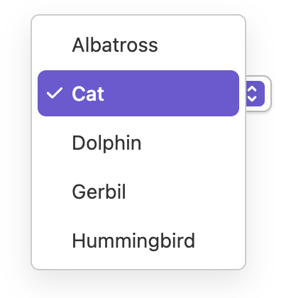
function Option({ item, state }) {
let ref = React.useRef();
let { optionProps, isSelected, isFocused, isDisabled } = useOption(
{ key: item.key },
state,
ref
);
let backgroundColor;
let color = 'black';
if (isSelected) {
backgroundColor = 'blueviolet';
color = 'white';
} else if (isFocused) {
backgroundColor = 'gray';
} else if (isDisabled) {
backgroundColor = 'transparent';
color = 'gray';
}
return (
<li
{...optionProps}
ref={ref}
style={{
background: backgroundColor,
color: color,
padding: '2px 5px',
outline: 'none',
cursor: 'pointer'
}}
>
{item.rendered}
</li>
);
}
import {useListBox, useOption} from 'react-aria';

function ListBox(props) {
  let ref = React.useRef();
  let { listBoxRef = ref, state } = props;
  let { listBoxProps } = useListBox(
    props,
    state,
    listBoxRef
  );

  return (
    <ul
      {...listBoxProps}
      ref={listBoxRef}
      style={{
        margin: 0,
        padding: 0,
        listStyle: 'none',
        maxHeight: '150px',
        overflow: 'auto'
      }}
    >
      {[...state.collection].map((item) => (
        <Option
          key={item.key}
          item={item}
          state={state}
        />
      ))}
    </ul>
  );
}

function Option({ item, state }) {
  let ref = React.useRef();
  let { optionProps, isSelected, isFocused, isDisabled } =
    useOption({ key: item.key }, state, ref);

  let backgroundColor;
  let color = 'black';

  if (isSelected) {
    backgroundColor = 'blueviolet';
    color = 'white';
  } else if (isFocused) {
    backgroundColor = 'gray';
  } else if (isDisabled) {
    backgroundColor = 'transparent';
    color = 'gray';
  }

  return (
    <li
      {...optionProps}
      ref={ref}
      style={{
        background: backgroundColor,
        color: color,
        padding: '2px 5px',
        outline: 'none',
        cursor: 'pointer'
      }}
    >
      {item.rendered}
    </li>
  );
}
import {
  useListBox,
  useOption
} from 'react-aria';

function ListBox(props) {
  let ref = React
    .useRef();
  let {
    listBoxRef = ref,
    state
  } = props;
  let { listBoxProps } =
    useListBox(
      props,
      state,
      listBoxRef
    );

  return (
    <ul
      {...listBoxProps}
      ref={listBoxRef}
      style={{
        margin: 0,
        padding: 0,
        listStyle:
          'none',
        maxHeight:
          '150px',
        overflow: 'auto'
      }}
    >
      {[
        ...state
          .collection
      ].map((item) => (
        <Option
          key={item.key}
          item={item}
          state={state}
        />
      ))}
    </ul>
  );
}

function Option(
  { item, state }
) {
  let ref = React
    .useRef();
  let {
    optionProps,
    isSelected,
    isFocused,
    isDisabled
  } = useOption(
    { key: item.key },
    state,
    ref
  );

  let backgroundColor;
  let color = 'black';

  if (isSelected) {
    backgroundColor =
      'blueviolet';
    color = 'white';
  } else if (isFocused) {
    backgroundColor =
      'gray';
  } else if (
    isDisabled
  ) {
    backgroundColor =
      'transparent';
    color = 'gray';
  }

  return (
    <li
      {...optionProps}
      ref={ref}
      style={{
        background:
          backgroundColor,
        color: color,
        padding:
          '2px 5px',
        outline: 'none',
        cursor: 'pointer'
      }}
    >
      {item.rendered}
    </li>
  );
}
Button#
The Button component is used in the above example to toggle the listbox popup. It is built using the useButton hook, and can be shared with many other components.
Show code
import {useButton} from 'react-aria';

function Button(props) {
  let ref = props.buttonRef;
  let { buttonProps } = useButton(props, ref);
  return (
    <button {...buttonProps} ref={ref} style={props.style}>
      {props.children}
    </button>
  );
}
import {useButton} from 'react-aria';

function Button(props) {
  let ref = props.buttonRef;
  let { buttonProps } = useButton(props, ref);
  return (
    <button {...buttonProps} ref={ref} style={props.style}>
      {props.children}
    </button>
  );
}
import {useButton} from 'react-aria';

function Button(props) {
  let ref =
    props.buttonRef;
  let { buttonProps } =
    useButton(
      props,
      ref
    );
  return (
    <button
      {...buttonProps}
      ref={ref}
      style={props.style}
    >
      {props.children}
    </button>
  );
}
Styled examples#
Usage#
The following examples show how to use the Select component created in the above example.
Dynamic collections#
Select follows the Collection Components API, accepting both static and dynamic collections.
The examples above show static collections, which can be used when the full list of options is known ahead of time. Dynamic collections,
as shown below, can be used when the options come from an external data source such as an API call, or update over time.
As seen below, an iterable list of options is passed to the Select using the items prop. Each item accepts a key prop, which
is passed to the onSelectionChange handler to identify the selected item. Alternatively, if the item objects contain an id property,
as shown in the example below, then this is used automatically and a key prop is not required.
function Example() {
  let options = [
    {id: 1, name: 'Aerospace'},
    {id: 2, name: 'Mechanical'},
    {id: 3, name: 'Civil'},
    {id: 4, name: 'Biomedical'},
    {id: 5, name: 'Nuclear'},
    {id: 6, name: 'Industrial'},
    {id: 7, name: 'Chemical'},
    {id: 8, name: 'Agricultural'},
    {id: 9, name: 'Electrical'}
  ];

  return (
    <>
      <Select label="Pick an engineering major" items={options}>
        {(item) => <Item>{item.name}</Item>}
      </Select>
    </>
  );
}
function Example() {
let options = [
{ id: 1, name: 'Aerospace' },
{ id: 2, name: 'Mechanical' },
{ id: 3, name: 'Civil' },
{ id: 4, name: 'Biomedical' },
{ id: 5, name: 'Nuclear' },
{ id: 6, name: 'Industrial' },
{ id: 7, name: 'Chemical' },
{ id: 8, name: 'Agricultural' },
{ id: 9, name: 'Electrical' }
];
return (
<>
<Select
label="Pick an engineering major"
items={options}
>
{(item) => <Item>{item.name}</Item>}
</Select>
</>
);
}
function Example() {
  let options = [
    {
      id: 1,
      name: 'Aerospace'
    },
    {
      id: 2,
      name: 'Mechanical'
    },
    {
      id: 3,
      name: 'Civil'
    },
    {
      id: 4,
      name: 'Biomedical'
    },
    {
      id: 5,
      name: 'Nuclear'
    },
    {
      id: 6,
      name: 'Industrial'
    },
    {
      id: 7,
      name: 'Chemical'
    },
    {
      id: 8,
      name:
        'Agricultural'
    },
    {
      id: 9,
      name: 'Electrical'
    }
  ];

  return (
    <>
      <Select
        label="Pick an engineering major"
        items={options}
      >
        {(item) => (
          <Item>
            {item.name}
          </Item>
        )}
      </Select>
    </>
  );
}
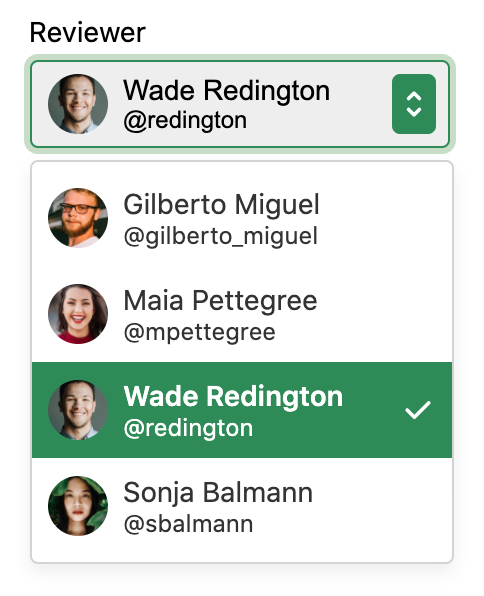
Controlled selection#
Setting a selected option can be done by using the defaultSelectedKey or selectedKey prop. The selected key corresponds to the key of an item.
When Select is used with a dynamic collection as described above, the key of each item is derived from the data.
See the react-stately Selection docs for more details.
function Example() {
  let options = [
    {name: 'Koala'},
    {name: 'Kangaroo'},
    {name: 'Platypus'},
    {name: 'Bald Eagle'},
    {name: 'Bison'},
    {name: 'Skunk'}
  ];
  let [animal, setAnimal] = React.useState("Bison");

  return (
    <Select
      label="Pick an animal (controlled)"
      items={options}
      selectedKey={animal}
      onSelectionChange={selected => setAnimal(selected)}>
      {item => <Item key={item.name}>{item.name}</Item>}
    </Select>
  );
}
function Example() {
let options = [
{name: 'Koala'},
{name: 'Kangaroo'},
{name: 'Platypus'},
{name: 'Bald Eagle'},
{name: 'Bison'},
{name: 'Skunk'}
];
let [animal, setAnimal] = React.useState("Bison");
return (
<Select
label="Pick an animal (controlled)"
items={options}
selectedKey={animal}
onSelectionChange={selected => setAnimal(selected)}>
{item => <Item key={item.name}>{item.name}</Item>}
</Select>
);
}function Example() {
let options = [
{ name: 'Koala' },
{ name: 'Kangaroo' },
{ name: 'Platypus' },
{
name: 'Bald Eagle'
},
{ name: 'Bison' },
{ name: 'Skunk' }
];
let [
animal,
setAnimal
] = React.useState(
'Bison'
);
return (
<Select
label="Pick an animal (controlled)"
items={options}
selectedKey={animal}
onSelectionChange={(selected) =>
setAnimal(
selected
)}
>
{(item) => (
<Item
key={item.name}
>
{item.name}
</Item>
)}
</Select>
);
}
Asynchronous loading#
This example uses the useAsyncList hook to handle asynchronous loading of data from a server. You may additionally want to display a spinner to indicate the loading state to the user, or support features like infinite scroll to load more data.
import {useAsyncList} from 'react-stately';

function AsyncLoadingExample() {
  let list = useAsyncList({
    async load({ signal, filterText }) {
      let res = await fetch(
        `https://pokeapi.co/api/v2/pokemon`,
        { signal }
      );
      let json = await res.json();

      return {
        items: json.results
      };
    }
  });

  return (
    <Select label="Pick a Pokemon" items={list.items} selectionMode="single">
      {(item) => (
        <Item key={item.name}>
          {item.name}
        </Item>
      )}
    </Select>
  );
}
import {useAsyncList} from 'react-stately';

function AsyncLoadingExample() {
  let list = useAsyncList({
    async load({ signal, filterText }) {
      let res = await fetch(
        `https://pokeapi.co/api/v2/pokemon`,
        { signal }
      );
      let json = await res.json();

      return {
        items: json.results
      };
    }
  });

  return (
    <Select
      label="Pick a Pokemon"
      items={list.items}
      selectionMode="single"
    >
      {(item) => <Item key={item.name}>{item.name}</Item>}
    </Select>
  );
}
import {useAsyncList} from 'react-stately';

function AsyncLoadingExample() {
  let list =
    useAsyncList({
      async load(
        {
          signal,
          filterText
        }
      ) {
        let res =
          await fetch(
            `https://pokeapi.co/api/v2/pokemon`,
            { signal }
          );
        let json =
          await res
            .json();

        return {
          items:
            json.results
        };
      }
    });

  return (
    <Select
      label="Pick a Pokemon"
      items={list.items}
      selectionMode="single"
    >
      {(item) => (
        <Item
          key={item.name}
        >
          {item.name}
        </Item>
      )}
    </Select>
  );
}
Disabled#
A Select can be fully disabled using the isDisabled prop.
<Select label="Choose frequency" isDisabled>
  <Item key="rarely">Rarely</Item>
  <Item key="sometimes">Sometimes</Item>
  <Item key="always">Always</Item>
</Select><Select label="Choose frequency" isDisabled>
<Item key="rarely">Rarely</Item>
<Item key="sometimes">Sometimes</Item>
<Item key="always">Always</Item>
</Select><Select
label="Choose frequency"
isDisabled
>
<Item key="rarely">
Rarely
</Item>
<Item key="sometimes">
Sometimes
</Item>
<Item key="always">
Always
</Item>
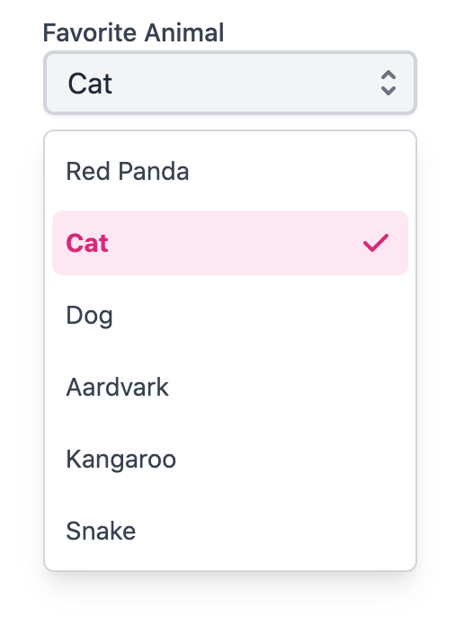
</Select>Disabled options#
useSelect supports marking items as disabled using the disabledKeys prop. Each key in this list
corresponds with the key prop passed to the Item component, or automatically derived from the values passed
to the items prop. See Collections for more details.
Disabled items are not focusable, selectable, or keyboard navigable. The isDisabled property returned by
useOption can be used to style the item appropriately.
<Select label="Favorite Animal" disabledKeys={['cat', 'kangaroo']}>
  <Item key="red panda">Red Panda</Item>
  <Item key="cat">Cat</Item>
  <Item key="dog">Dog</Item>
  <Item key="aardvark">Aardvark</Item>
  <Item key="kangaroo">Kangaroo</Item>
  <Item key="snake">Snake</Item>
</Select><Select
label="Favorite Animal"
disabledKeys={['cat', 'kangaroo']}
>
<Item key="red panda">Red Panda</Item>
<Item key="cat">Cat</Item>
<Item key="dog">Dog</Item>
<Item key="aardvark">Aardvark</Item>
<Item key="kangaroo">Kangaroo</Item>
<Item key="snake">Snake</Item>
</Select><Select
label="Favorite Animal"
disabledKeys={[
'cat',
'kangaroo'
]}
>
<Item key="red panda">
Red Panda
</Item>
<Item key="cat">
Cat
</Item>
<Item key="dog">
Dog
</Item>
<Item key="aardvark">
Aardvark
</Item>
<Item key="kangaroo">
Kangaroo
</Item>
<Item key="snake">
Snake
</Item>
</Select>Controlled open state#
The open state of the select can be controlled via the defaultOpen and isOpen props
function Example() {
  let [open, setOpen] = React.useState(false);

  return (
    <>
      <p>Select is {open ? 'open' : 'closed'}</p>
      <Select label="Choose frequency" isOpen={open} onOpenChange={setOpen}>
        <Item key="rarely">Rarely</Item>
        <Item key="sometimes">Sometimes</Item>
        <Item key="always">Always</Item>
      </Select>
    </>
  );
}
function Example() {
let [open, setOpen] = React.useState(false);
return (
<>
<p>Select is {open ? 'open' : 'closed'}</p>
<Select
label="Choose frequency"
isOpen={open}
onOpenChange={setOpen}
>
<Item key="rarely">Rarely</Item>
<Item key="sometimes">Sometimes</Item>
<Item key="always">Always</Item>
</Select>
</>
);
}
function Example() {
  let [open, setOpen] =
    React.useState(
      false
    );

  return (
    <>
      <p>
        Select is {open
          ? 'open'
          : 'closed'}
      </p>
      <Select
        label="Choose frequency"
        isOpen={open}
        onOpenChange={setOpen}
      >
        <Item key="rarely">
          Rarely
        </Item>
        <Item key="sometimes">
          Sometimes
        </Item>
        <Item key="always">
          Always
        </Item>
      </Select>
    </>
  );
}
Internationalization#
useSelect and useListBox handle some aspects of internationalization automatically.
For example, type to select is implemented with an
Intl.Collator
for internationalized string matching. You are responsible for localizing all labels and option
content that is passed into the select.
RTL#
In right-to-left languages, the select should be mirrored. The arrow should be on the left, and the selected value should be on the right. In addition, the content of list options should flip. Ensure that your CSS accounts for this.