Tree
A tree provides users with a way to navigate nested hierarchical information, with support for keyboard navigation and selection.
| install | yarn add react-aria-components |
|---|---|
| version | 1.6.0 |
| usage | import {UNSTABLE_Tree} from 'react-aria-components' |
Example#
import {
UNSTABLE_Tree as Tree,
UNSTABLE_TreeItem as TreeItem,
UNSTABLE_TreeItemContent as TreeItemContent,
Button,
Collection
} from 'react-aria-components';
import {MyCheckbox} from './Checkbox';
let items = [
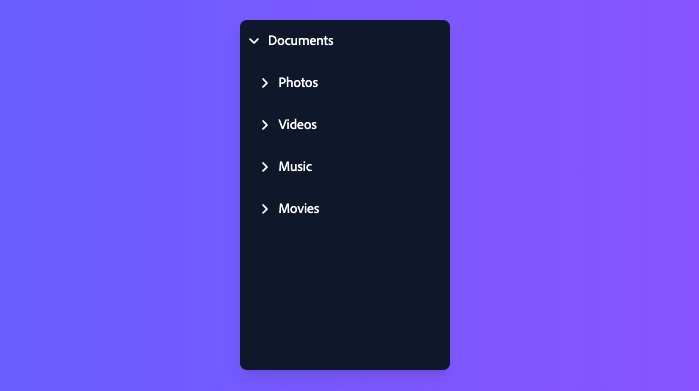
{id: 1, title: 'Documents', children: [
{id: 2, title: 'Project', children: [
{id: 3, title: 'Weekly Report', children: []}
]}
]},
{id: 4, title: 'Photos', children: [
{id: 5, title: 'Image 1', children: []},
{id: 6, title: 'Image 2', children: []}
]}
];
<Tree aria-label="Files" selectionMode="multiple" items={items}>
{function renderItem(item) {
return (
<TreeItem textValue={item.title}>
<TreeItemContent>
{item.children.length ? <Button slot="chevron">
<svg viewBox="0 0 24 24">
<path d="m8.25 4.5 7.5 7.5-7.5 7.5" />
</svg>
</Button> : null}
<MyCheckbox slot="selection" />
{item.title}
<Button aria-label="Info">ⓘ</Button>
</TreeItemContent>
<Collection items={item.children}>
{renderItem}
</Collection>
</TreeItem>
);
}}
</Tree>import {
Button,
Collection,
UNSTABLE_Tree as Tree,
UNSTABLE_TreeItem as TreeItem,
UNSTABLE_TreeItemContent as TreeItemContent
} from 'react-aria-components';
import {MyCheckbox} from './Checkbox';
let items = [
{
id: 1,
title: 'Documents',
children: [
{
id: 2,
title: 'Project',
children: [
{ id: 3, title: 'Weekly Report', children: [] }
]
}
]
},
{
id: 4,
title: 'Photos',
children: [
{ id: 5, title: 'Image 1', children: [] },
{ id: 6, title: 'Image 2', children: [] }
]
}
];
<Tree
aria-label="Files"
selectionMode="multiple"
items={items}
>
{function renderItem(item) {
return (
<TreeItem textValue={item.title}>
<TreeItemContent>
{item.children.length
? (
<Button slot="chevron">
<svg viewBox="0 0 24 24">
<path d="m8.25 4.5 7.5 7.5-7.5 7.5" />
</svg>
</Button>
)
: null}
<MyCheckbox slot="selection" />
{item.title}
<Button aria-label="Info">ⓘ</Button>
</TreeItemContent>
<Collection items={item.children}>
{renderItem}
</Collection>
</TreeItem>
);
}}
</Tree>import {
Button,
Collection,
UNSTABLE_Tree as Tree,
UNSTABLE_TreeItem
as TreeItem,
UNSTABLE_TreeItemContent
as TreeItemContent
} from 'react-aria-components';
import {MyCheckbox} from './Checkbox';
let items = [
{
id: 1,
title: 'Documents',
children: [
{
id: 2,
title: 'Project',
children: [
{
id: 3,
title:
'Weekly Report',
children: []
}
]
}
]
},
{
id: 4,
title: 'Photos',
children: [
{
id: 5,
title: 'Image 1',
children: []
},
{
id: 6,
title: 'Image 2',
children: []
}
]
}
];
<Tree
aria-label="Files"
selectionMode="multiple"
items={items}
>
{function renderItem(
item
) {
return (
<TreeItem
textValue={item
.title}
>
<TreeItemContent>
{item
.children
.length
? (
<Button slot="chevron">
<svg viewBox="0 0 24 24">
<path d="m8.25 4.5 7.5 7.5-7.5 7.5" />
</svg>
</Button>
)
: null}
<MyCheckbox slot="selection" />
{item.title}
<Button aria-label="Info">
ⓘ
</Button>
</TreeItemContent>
<Collection
items={item
.children}
>
{renderItem}
</Collection>
</TreeItem>
);
}}
</Tree>Show CSS
.react-aria-Tree {
  display: flex;
  flex-direction: column;
  gap: 2px;
  overflow: auto;
  padding: 4px;
  border: 1px solid var(--border-color);
  border-radius: 6px;
  background: var(--overlay-background);
  forced-color-adjust: none;
  outline: none;
  width: 250px;
  max-height: 300px;
  box-sizing: border-box;

  &[data-focus-visible] {
    outline: 2px solid var(--focus-ring-color);
    outline-offset: -1px;
  }

  .react-aria-TreeItem {
    display: flex;
    align-items: center;
    gap: 0.571rem;
    min-height: 28px;
    padding: 0.286rem 0.286rem 0.286rem 0.571rem;
    --padding: 20px;
    padding-left: calc((var(--tree-item-level) - 1) * 20px + 0.571rem + var(--padding));
    border-radius: 6px;
    outline: none;
    cursor: default;
    color: var(--text-color);
    font-size: 1.072rem;
    position: relative;
    transform: translateZ(0);

    &[data-has-child-items] {
      --padding: 0px;
    }

    .react-aria-Button[slot=chevron] {
      all: unset;
      display: flex;
      align-items: center;
      justify-content: center;
      width: 1.143rem;
      height: 1.143rem;

      svg {
        rotate: 0deg;
        transition: rotate 200ms;
        width: 12px;
        height: 12px;
        fill: none;
        stroke: currentColor;
        stroke-width: 3px;
      }
    }

    &[data-expanded] .react-aria-Button[slot=chevron] svg {
      rotate: 90deg;
    }

    &[data-focus-visible] {
      outline: 2px solid var(--focus-ring-color);
      outline-offset: -2px;
    }

    &[data-pressed] {
      background: var(--gray-100);
    }

    &[data-selected] {
      background: var(--highlight-background);
      color: var(--highlight-foreground);
      --focus-ring-color: var(--highlight-foreground);

      &[data-focus-visible] {
        outline-color: var(--highlight-foreground);
        outline-offset: -4px;
      }

      .react-aria-Button {
        color: var(--highlight-foreground);
        --highlight-hover: rgb(255 255 255 / 0.1);
        --highlight-pressed: rgb(255 255 255 / 0.2);
      }
    }

    &[data-disabled] {
      color: var(--text-color-disabled);
    }

    .react-aria-Button:not([slot]) {
      margin-left: auto;
      background: transparent;
      border: none;
      font-size: 1.2rem;
      line-height: 1.2em;
      padding: 0.286rem 0.429rem;
      transition: background 200ms;

      &[data-hovered] {
        background: var(--highlight-hover);
      }

      &[data-pressed] {
        background: var(--highlight-pressed);
        box-shadow: none;
      }
    }
  }

  /* join selected items if :has selector is supported */
  @supports selector(:has(.foo)) {
    gap: 0;

    .react-aria-TreeItem[data-selected]:has(+ [data-selected]) {
      border-end-start-radius: 0;
      border-end-end-radius: 0;
    }

    .react-aria-TreeItem[data-selected] + [data-selected] {
      border-start-start-radius: 0;
      border-start-end-radius: 0;
    }
  }

  :where(.react-aria-TreeItem) .react-aria-Checkbox {
    --selected-color: var(--highlight-foreground);
    --selected-color-pressed: var(--highlight-foreground-pressed);
    --checkmark-color: var(--highlight-background);
    --background-color: var(--highlight-background);
  }
}.react-aria-Tree {
display: flex;
flex-direction: column;
gap: 2px;
overflow: auto;
padding: 4px;
border: 1px solid var(--border-color);
border-radius: 6px;
background: var(--overlay-background);
forced-color-adjust: none;
outline: none;
width: 250px;
max-height: 300px;
box-sizing: border-box;
&[data-focus-visible] {
outline: 2px solid var(--focus-ring-color);
outline-offset: -1px;
}
.react-aria-TreeItem {
display: flex;
align-items: center;
gap: 0.571rem;
min-height: 28px;
padding: 0.286rem 0.286rem 0.286rem 0.571rem;
--padding: 20px;
padding-left: calc((var(--tree-item-level) - 1) * 20px + 0.571rem + var(--padding));
border-radius: 6px;
outline: none;
cursor: default;
color: var(--text-color);
font-size: 1.072rem;
position: relative;
transform: translateZ(0);
&[data-has-child-items] {
--padding: 0px;
}
.react-aria-Button[slot=chevron] {
all: unset;
display: flex;
align-items: center;
justify-content: center;
width: 1.143rem;
height: 1.143rem;
svg {
rotate: 0deg;
transition: rotate 200ms;
width: 12px;
height: 12px;
fill: none;
stroke: currentColor;
stroke-width: 3px;
}
}
&[data-expanded] .react-aria-Button[slot=chevron] svg {
rotate: 90deg;
}
&[data-focus-visible] {
outline: 2px solid var(--focus-ring-color);
outline-offset: -2px;
}
&[data-pressed] {
background: var(--gray-100);
}
&[data-selected] {
background: var(--highlight-background);
color: var(--highlight-foreground);
--focus-ring-color: var(--highlight-foreground);
&[data-focus-visible] {
outline-color: var(--highlight-foreground);
outline-offset: -4px;
}
.react-aria-Button {
color: var(--highlight-foreground);
--highlight-hover: rgb(255 255 255 / 0.1);
--highlight-pressed: rgb(255 255 255 / 0.2);
}
}
&[data-disabled] {
color: var(--text-color-disabled);
}
.react-aria-Button:not([slot]) {
margin-left: auto;
background: transparent;
border: none;
font-size: 1.2rem;
line-height: 1.2em;
padding: 0.286rem 0.429rem;
transition: background 200ms;
&[data-hovered] {
background: var(--highlight-hover);
}
&[data-pressed] {
background: var(--highlight-pressed);
box-shadow: none;
}
}
}
/* join selected items if :has selector is supported */
@supports selector(:has(.foo)) {
gap: 0;
.react-aria-TreeItem[data-selected]:has(+ [data-selected]) {
border-end-start-radius: 0;
border-end-end-radius: 0;
}
.react-aria-TreeItem[data-selected] + [data-selected] {
border-start-start-radius: 0;
border-start-end-radius: 0;
}
}
:where(.react-aria-TreeItem) .react-aria-Checkbox {
--selected-color: var(--highlight-foreground);
--selected-color-pressed: var(--highlight-foreground-pressed);
--checkmark-color: var(--highlight-background);
--background-color: var(--highlight-background);
}
}Static Tree Example#
import {Button} from 'react-aria-components';

function MyTreeItemContent(props) {
  return (
    <TreeItemContent>
      {({ hasChildRows }) => (
        <>
          {hasChildRows && (
            <Button slot="chevron">
              <svg viewBox="0 0 24 24">
                <path d="m8.25 4.5 7.5 7.5-7.5 7.5" />
              </svg>
            </Button>
          )}
          {props.children}
        </>
      )}
    </TreeItemContent>
  );
}

<Tree
  aria-label="Files"
  style={{ height: '300px' }}
  defaultExpandedKeys={['documents', 'photos', 'project']}
>
  <TreeItem id="documents" textValue="Documents">
    <MyTreeItemContent>
      Documents
    </MyTreeItemContent>
    <TreeItem id="project" textValue="Project">
      <MyTreeItemContent>
        Project
      </MyTreeItemContent>
      <TreeItem id="report" textValue="Weekly Report">
        <MyTreeItemContent>
          Weekly Report
        </MyTreeItemContent>
      </TreeItem>
    </TreeItem>
  </TreeItem>
  <TreeItem id="photos" textValue="Photos">
    <MyTreeItemContent>
      Photos
    </MyTreeItemContent>
    <TreeItem id="one" textValue="Image 1">
      <MyTreeItemContent>
        Image 1
      </MyTreeItemContent>
    </TreeItem>
    <TreeItem id="two" textValue="Image 2">
      <MyTreeItemContent>
        Image 2
      </MyTreeItemContent>
    </TreeItem>
  </TreeItem>
</Tree>
import {Button} from 'react-aria-components';
function MyTreeItemContent(props) {
return (
<TreeItemContent>
{({ hasChildRows }) => (
<>
{hasChildRows && (
<Button slot="chevron">
<svg viewBox="0 0 24 24">
<path d="m8.25 4.5 7.5 7.5-7.5 7.5" />
</svg>
</Button>
)}
{props.children}
</>
)}
</TreeItemContent>
);
}
<Tree
aria-label="Files"
style={{ height: '300px' }}
defaultExpandedKeys={['documents', 'photos', 'project']}
>
<TreeItem id="documents" textValue="Documents">
<MyTreeItemContent>
Documents
</MyTreeItemContent>
<TreeItem id="project" textValue="Project">
<MyTreeItemContent>
Project
</MyTreeItemContent>
<TreeItem id="report" textValue="Weekly Report">
<MyTreeItemContent>
Weekly Report
</MyTreeItemContent>
</TreeItem>
</TreeItem>
</TreeItem>
<TreeItem id="photos" textValue="Photos">
<MyTreeItemContent>
Photos
</MyTreeItemContent>
<TreeItem id="one" textValue="Image 1">
<MyTreeItemContent>
Image 1
</MyTreeItemContent>
</TreeItem>
<TreeItem id="two" textValue="Image 2">
<MyTreeItemContent>
Image 2
</MyTreeItemContent>
</TreeItem>
</TreeItem>
</Tree>import {Button} from 'react-aria-components';
function MyTreeItemContent(
props
) {
return (
<TreeItemContent>
{(
{ hasChildRows }
) => (
<>
{hasChildRows &&
(
<Button slot="chevron">
<svg viewBox="0 0 24 24">
<path d="m8.25 4.5 7.5 7.5-7.5 7.5" />
</svg>
</Button>
)}
{props
.children}
</>
)}
</TreeItemContent>
);
}
<Tree
aria-label="Files"
style={{
height: '300px'
}}
defaultExpandedKeys={[
'documents',
'photos',
'project'
]}
>
<TreeItem
id="documents"
textValue="Documents"
>
<MyTreeItemContent>
Documents
</MyTreeItemContent>
<TreeItem
id="project"
textValue="Project"
>
<MyTreeItemContent>
Project
</MyTreeItemContent>
<TreeItem
id="report"
textValue="Weekly Report"
>
<MyTreeItemContent>
Weekly Report
</MyTreeItemContent>
</TreeItem>
</TreeItem>
</TreeItem>
<TreeItem
id="photos"
textValue="Photos"
>
<MyTreeItemContent>
Photos
</MyTreeItemContent>
<TreeItem
id="one"
textValue="Image 1"
>
<MyTreeItemContent>
Image 1
</MyTreeItemContent>
</TreeItem>
<TreeItem
id="two"
textValue="Image 2"
>
<MyTreeItemContent>
Image 2
</MyTreeItemContent>
</TreeItem>
</TreeItem>
</Tree>Features#
A tree can be built using the <ul>, <li>,
and <ol>, but is very limited in functionality especially when it comes to user interactions.
HTML lists are meant for static content, rather than heirarchies with rich interactions like focusable elements within cells, keyboard navigation, row selection, sorting, etc.
Tree helps achieve accessible and interactive tree components that can be styled as needed.
- Row selection – Single or multiple selection, with optional checkboxes, disabled rows, and both
toggleandreplaceselection behaviors. - Interactive children – Tree rows may include interactive elements such as buttons, menus, etc.
- Actions – Rows support optional actions such as navigation via click, tap, double click, or Enter key.
- Keyboard navigation – Tree rows and focusable children can be navigated using the arrow keys, along with page up/down, home/end, etc. Typeahead, auto scrolling, and selection modifier keys are supported as well.
- Touch friendly – Selection and actions adapt their behavior depending on the device. For example, selection is activated via long press on touch when row actions are present.
- Accessible – Follows the ARIA grid pattern, with additional selection announcements via an ARIA live region. Extensively tested across many devices and assistive technologies to ensure announcements and behaviors are consistent.
Anatomy#
A Tree consists of a container element, with rows containing data inside. The rows within a tree may contain focusable elements or plain text content. Each row may also contain a button to toggle the expandable state of that row.
If the tree supports row selection, each row can optionally include a selection checkbox.
Concepts#
Tree makes use of the following concepts:
Composed components#
A Tree uses the following components, which may also be used standalone or reused in other components.
Examples#
Starter kits#
To help kick-start your project, we offer starter kits that include example implementations of all React Aria components with various styling solutions. All components are fully styled, including support for dark mode, high contrast mode, and all UI states. Each starter comes with a pre-configured Storybook that you can experiment with, or use as a starting point for your own component library.
Reusable wrappers#
If you will use a Tree in multiple places in your app, you can wrap all of the pieces into a reusable component. This way, the DOM structure, styling code, and other logic are defined in a single place and reused everywhere to ensure consistency.
The following example includes a custom
Content#
let items = [
  {id: 1, title: 'Documents', children: [
    {id: 2, title: 'Project', children: [
      {id: 3, title: 'Weekly Report', children: []}
    ]}
  ]},
  {id: 4, title: 'Photos', children: [
    {id: 5, title: 'Image 1', children: []},
    {id: 6, title: 'Image 2', children: []}
  ]}
];
function FileTree(props) {
  return (
    <Tree aria-label="Files" items={items} {...props}>
      {function renderItem(item) {
        return (
          <TreeItem textValue={item.title}>
            <TreeItemContent>
              {({hasChildRows}) => (
                <>
                  {hasChildRows ? <Button slot="chevron">
                    <svg viewBox="0 0 24 24">
                      <path d="m8.25 4.5 7.5 7.5-7.5 7.5" />
                    </svg>
                  </Button> : null}
                  <MyCheckbox slot="selection" />
                  {item.title}
                  <Button aria-label="Info">ⓘ</Button>
                </>
              )}
            </TreeItemContent>
            <Collection items={item.children}>
              {renderItem}
            </Collection>
          </TreeItem>
        );
      }}
    </Tree>
  )
}
let items = [
{id: 1, title: 'Documents', children: [
{id: 2, title: 'Project', children: [
{id: 3, title: 'Weekly Report', children: []}
]}
]},
{id: 4, title: 'Photos', children: [
{id: 5, title: 'Image 1', children: []},
{id: 6, title: 'Image 2', children: []}
]}
];
function FileTree(props) {
return (
<Tree aria-label="Files" items={items} {...props}>
{function renderItem(item) {
return (
<TreeItem textValue={item.title}>
<TreeItemContent>
{({hasChildRows}) => (
<>
{hasChildRows ? <Button slot="chevron">
<svg viewBox="0 0 24 24">
<path d="m8.25 4.5 7.5 7.5-7.5 7.5" />
</svg>
</Button> : null}
<MyCheckbox slot="selection" />
{item.title}
<Button aria-label="Info">ⓘ</Button>
</>
)}
</TreeItemContent>
<Collection items={item.children}>
{renderItem}
</Collection>
</TreeItem>
);
}}
</Tree>
)
}let items = [
{
id: 1,
title: 'Documents',
children: [
{
id: 2,
title: 'Project',
children: [
{
id: 3,
title:
'Weekly Report',
children: []
}
]
}
]
},
{
id: 4,
title: 'Photos',
children: [
{
id: 5,
title: 'Image 1',
children: []
},
{
id: 6,
title: 'Image 2',
children: []
}
]
}
];
function FileTree(
props
) {
return (
<Tree
aria-label="Files"
items={items}
{...props}
>
{function renderItem(
item
) {
return (
<TreeItem
textValue={item
.title}
>
<TreeItemContent>
{(
{
hasChildRows
}
) => (
<>
{hasChildRows
? (
<Button slot="chevron">
<svg viewBox="0 0 24 24">
<path d="m8.25 4.5 7.5 7.5-7.5 7.5" />
</svg>
</Button>
)
: null}
<MyCheckbox slot="selection" />
{item
.title}
<Button aria-label="Info">
ⓘ
</Button>
</>
)}
</TreeItemContent>
<Collection
items={item
.children}
>
{renderItem}
</Collection>
</TreeItem>
);
}}
</Tree>
);
}
Selection#
Single selection#
By default, Tree doesn't allow row selection but this can be enabled using the selectionMode prop. Use defaultSelectedKeys to provide a default set of selected rows.
Note that the value of the selected keys must match the id prop of the row.
The example below enables single selection mode, and uses defaultSelectedKeys to select the row with id equal to 2.
A user can click on a different row to change the selection, or click on the same row again to deselect it entirely.
// Using the example above
<FileTree
  selectionMode="single"
  defaultSelectedKeys={[2]}
  defaultExpandedKeys={[1]}
/>
// Using the example above
<FileTree
selectionMode="single"
defaultSelectedKeys={[2]}
defaultExpandedKeys={[1]}
/>// Using the example above
<FileTree
selectionMode="single"
defaultSelectedKeys={[
2
]}
defaultExpandedKeys={[
1
]}
/>Multiple selection#
Multiple selection can be enabled by setting selectionMode to multiple.
// Using the example above
<FileTree
  selectionMode="multiple"
  defaultSelectedKeys={[2, 4]}
  defaultExpandedKeys={[1]}
/>
// Using the example above
<FileTree
selectionMode="multiple"
defaultSelectedKeys={[2, 4]}
defaultExpandedKeys={[1]}
/>// Using the example above
<FileTree
selectionMode="multiple"
defaultSelectedKeys={[
2,
4
]}
defaultExpandedKeys={[
1
]}
/>Disallow empty selection#
Table also supports a disallowEmptySelection prop which forces the user to have at least one row in the Table selected at all times.
In this mode, if a single row is selected and the user presses it, it will not be deselected.
// Using the example above
<FileTree
  selectionMode="single"
  defaultSelectedKeys={[2]}
  defaultExpandedKeys={[1]}
  disallowEmptySelection
/>
// Using the example above
<FileTree
selectionMode="single"
defaultSelectedKeys={[2]}
defaultExpandedKeys={[1]}
disallowEmptySelection
/>// Using the example above
<FileTree
selectionMode="single"
defaultSelectedKeys={[
2
]}
defaultExpandedKeys={[
1
]}
disallowEmptySelection
/>Props#
Tree#
| Name | Type | Default | Description |
selectionBehavior | SelectionBehavior | — | How multiple selection should behave in the tree. |
renderEmptyState | (
(props: TreeEmptyStateRenderProps
)) => ReactNode | — | Provides content to display when there are no items in the list. |
disabledBehavior | DisabledBehavior | 'all' | Whether disabledKeys applies to all interactions, or only selection. |
autoFocus | boolean | FocusStrategy | — | Whether to auto focus the gridlist or an option. |
items | Iterable<T> | — | Item objects in the collection. |
disabledKeys | Iterable<Key> | — | The item keys that are disabled. These items cannot be selected, focused, or otherwise interacted with. |
selectionMode | SelectionMode | — | The type of selection that is allowed in the collection. |
disallowEmptySelection | boolean | — | Whether the collection allows empty selection. |
selectedKeys | 'all' | Iterable<Key> | — | The currently selected keys in the collection (controlled). |
defaultSelectedKeys | 'all' | Iterable<Key> | — | The initial selected keys in the collection (uncontrolled). |
children | ReactNode | (
(item: object
)) => ReactNode | — | The contents of the collection. |
dependencies | ReadonlyArray<any> | — | Values that should invalidate the item cache when using dynamic collections. |
className | string | (
(values: TreeRenderProps
& & {}
)) => string | — | The CSS className for the element. A function may be provided to compute the class based on component state. |
style | CSSProperties | (
(values: TreeRenderProps
& & {}
)) => CSSProperties | undefined | — | The inline style for the element. A function may be provided to compute the style based on component state. |
expandedKeys | Iterable<Key> | — | The currently expanded keys in the collection (controlled). |
defaultExpandedKeys | Iterable<Key> | — | The initial expanded keys in the collection (uncontrolled). |
Events
| Name | Type | Description |
onAction | (
(key: Key
)) => void | Handler that is called when a user performs an action on an item. The exact user event depends on
the collection's |
onSelectionChange | (
(keys: Selection
)) => void | Handler that is called when the selection changes. |
onScroll | (
(e: UIEvent<Element>
)) => void | Handler that is called when a user scrolls. See MDN. |
onExpandedChange | (
(keys: Set<Key>
)) => any | Handler that is called when items are expanded or collapsed. |
Layout
| Name | Type | Description |
slot | string | null | A slot name for the component. Slots allow the component to receive props from a parent component.
An explicit |
Accessibility
| Name | Type | Description |
id | string | The element's unique identifier. See MDN. |
aria-label | string | Defines a string value that labels the current element. |
aria-labelledby | string | Identifies the element (or elements) that labels the current element. |
aria-describedby | string | Identifies the element (or elements) that describes the object. |
aria-details | string | Identifies the element (or elements) that provide a detailed, extended description for the object. |
TreeItem#
| Name | Type | Description |
textValue | string | A string representation of the tree item's contents, used for features like typeahead. |
children | ReactNode | The content of the tree item along with any nested children. Supports static nested tree items or use of a Collection to dynamically render nested tree items. |
id | Key | The unique id of the tree row. |
value | object | The object value that this tree item represents. When using dynamic collections, this is set automatically. |
className | string | (
(values: TreeItemRenderProps
& & {}
)) => string | The CSS className for the element. A function may be provided to compute the class based on component state. |
style | CSSProperties | (
(values: TreeItemRenderProps
& & {}
)) => CSSProperties | undefined | The inline style for the element. A function may be provided to compute the style based on component state. |
href | Href | A URL to link to. See MDN. |
hrefLang | string | Hints at the human language of the linked URL. SeeMDN. |
target | HTMLAttributeAnchorTarget | The target window for the link. See MDN. |
rel | string | The relationship between the linked resource and the current page. See MDN. |
download | boolean | string | Causes the browser to download the linked URL. A string may be provided to suggest a file name. See MDN. |
ping | string | A space-separated list of URLs to ping when the link is followed. See MDN. |
referrerPolicy | HTMLAttributeReferrerPolicy | How much of the referrer to send when following the link. See MDN. |
routerOptions | RouterOptions | Options for the configured client side router. |
hasChildItems | boolean | Whether this item has children, even if not loaded yet. |
Events
| Name | Type | Description |
onHoverStart | (
(e: HoverEvent
)) => void | Handler that is called when a hover interaction starts. |
onHoverEnd | (
(e: HoverEvent
)) => void | Handler that is called when a hover interaction ends. |
onHoverChange | (
(isHovering: boolean
)) => void | Handler that is called when the hover state changes. |
Accessibility
| Name | Type | Description |
aria-label | string | An accessibility label for this tree item. |
TreeItemContent#
| Name | Type | Description |
children | ReactNode | (
(values: T
& & {}
)) => ReactNode | The children of the component. A function may be provided to alter the children based on component state. |
Styling#
React Aria components can be styled in many ways, including using CSS classes, inline styles, utility classes (e.g. Tailwind), CSS-in-JS (e.g. Styled Components), etc. By default, all components include a builtin className attribute which can be targeted using CSS selectors. These follow the react-aria-ComponentName naming convention.
.react-aria-Tree {
  /* ... */
}.react-aria-Tree {
/* ... */
}.react-aria-Tree {
/* ... */
}A custom className can also be specified on any component. This overrides the default className provided by React Aria with your own.
<TreeItem className="my-tree-item">
  {/* ... */}
</TreeItem><TreeItem className="my-tree-item">
{/* ... */}
</TreeItem><TreeItem className="my-tree-item">
{/* ... */}
</TreeItem>In addition, some components support multiple UI states (e.g. focused, placeholder, readonly, etc.). React Aria components expose states using data attributes, which you can target in CSS selectors. For example:
.react-aria-TreeItem[data-expanded] {
  /* ... */
}

.react-aria-TreeItem[data-selected] {
  /* ... */
}.react-aria-TreeItem[data-expanded] {
/* ... */
}
.react-aria-TreeItem[data-selected] {
/* ... */
}.react-aria-TreeItem[data-expanded] {
/* ... */
}
.react-aria-TreeItem[data-selected] {
/* ... */
}The className and style props also accept functions which receive states for styling. This lets you dynamically determine the classes or styles to apply, which is useful when using utility CSS libraries like Tailwind.
<TreeItem
  className={({ isSelected }) => isSelected ? 'bg-blue-400' : 'bg-gray-100'}
/><TreeItem
className={({ isSelected }) =>
isSelected ? 'bg-blue-400' : 'bg-gray-100'}
/><TreeItem
className={(
{ isSelected }
) =>
isSelected
? 'bg-blue-400'
: 'bg-gray-100'}
/>Render props may also be used as children to alter what elements are rendered based on the current state. For example, you could render a checkbox only when selection is enabled.
<TreeItem>
  {({selectionMode}) => (
    <>
      {selectionMode !== 'none' && <Checkbox />}
      Item
    </>
  )}
</TreeItem><TreeItem>
{({selectionMode}) => (
<>
{selectionMode !== 'none' && <Checkbox />}
Item
</>
)}
</TreeItem><TreeItem>
{(
{ selectionMode }
) => (
<>
{selectionMode !==
'none' && (
<Checkbox />
)}
Item
</>
)}
</TreeItem>The states, selectors, and render props for each component used in a Tree are documented below.
Tree#
A Tree can be targeted with the .react-aria-Tree CSS selector, or by overriding with a custom className. It supports the following states:
| Name | CSS Selector | Description |
isEmpty | [data-empty] | Whether the tree has no items and should display its empty state. |
isFocused | [data-focused] | Whether the tree is currently focused. |
isFocusVisible | [data-focus-visible] | Whether the tree is currently keyboard focused. |
state | — | State of the tree. |
TreeItem#
A TreeItem can be targeted with the .react-aria-TreeItem CSS selector, or by overriding with a custom className. It supports the following states and render props:
| Name | CSS Selector | Description |
isExpanded | [data-expanded] | Whether the tree item is expanded. |
isFocusVisibleWithin | — | Whether the tree item's children have keyboard focus. |
isHovered | [data-hovered] | Whether the item is currently hovered with a mouse. |
isPressed | [data-pressed] | Whether the item is currently in a pressed state. |
isSelected | [data-selected] | Whether the item is currently selected. |
isFocused | [data-focused] | Whether the item is currently focused. |
isFocusVisible | [data-focus-visible] | Whether the item is currently keyboard focused. |
isDisabled | [data-disabled] | Whether the item is non-interactive, i.e. both selection and actions are disabled and the item may
not be focused. Dependent on |
selectionMode | [data-selection-mode="single | multiple"] | The type of selection that is allowed in the collection. |
selectionBehavior | — | The selection behavior for the collection. |
TreeItem also exposes a --tree-item-level CSS custom property, which you can use to adjust the indentation.
.react-aria-TreeItem {
  padding-left: calc((var(--tree-item-level) - 1) * 20px);
}.react-aria-TreeItem {
padding-left: calc((var(--tree-item-level) - 1) * 20px);
}.react-aria-TreeItem {
padding-left: calc((var(--tree-item-level) - 1) * 20px);
}TreeItemContent#
A TreeItemContent can be targeted with the .react-aria-TreeItemContent CSS selector, or by overriding with a custom className. It supports the following states and render props:
| Name | CSS Selector | Description |
isExpanded | [data-expanded] | Whether the tree item is expanded. |
hasChildItems | — | |
level | — | |
isFocusVisibleWithin | — | |
state | — | |
id | — | |
isHovered | [data-hovered] | Whether the item is currently hovered with a mouse. |
isPressed | [data-pressed] | Whether the item is currently in a pressed state. |
isSelected | [data-selected] | Whether the item is currently selected. |
isFocused | [data-focused] | Whether the item is currently focused. |
isFocusVisible | [data-focus-visible] | Whether the item is currently keyboard focused. |
isDisabled | [data-disabled] | Whether the item is non-interactive, i.e. both selection and actions are disabled and the item may
not be focused. Dependent on |
selectionMode | [data-selection-mode="single | multiple"] | The type of selection that is allowed in the collection. |
selectionBehavior | — | The selection behavior for the collection. |
allowsDragging | [data-allows-dragging] | Whether the item allows dragging. |
isDragging | [data-dragging] | Whether the item is currently being dragged. |
isDropTarget | [data-drop-target] | Whether the item is currently an active drop target. |
Testing#
Test utils alpha#
@react-aria/test-utils offers common tree interaction utilities which you may find helpful when writing tests. See here for more information on how to setup these utilities
in your tests. Below is the full definition of the tree tester and a sample of how you could use it in your test suite.
// Tree.test.ts
import {render, within} from '@testing-library/react';
import {User} from '@react-aria/test-utils';

let testUtilUser = new User({ interactionType: 'mouse' });
// ...

it('Tree can select a row via keyboard', async function () {
  // Render your test component/app and initialize the Tree tester
  let { getByTestId } = render(
    <Tree data-testid="test-tree" selectionMode="multiple">
      ...
    </Tree>
  );
  let treeTester = testUtilUser.createTester('Tree', {
    root: getByTestId('test-tree'),
    interactionType: 'keyboard'
  });

  await treeTester.toggleRowSelection({ row: 0 });
  expect(treeTester.selectedRows).toHaveLength(1);
  expect(within(treeTester.rows[0]).getByRole('checkbox')).toBeChecked();

  await treeTester.toggleRowSelection({ row: 1 });
  expect(treeTester.selectedRows).toHaveLength(2);
  expect(within(treeTester.rows[1]).getByRole('checkbox')).toBeChecked();

  await treeTester.toggleRowSelection({ row: 0 });
  expect(treeTester.selectedRows).toHaveLength(1);
  expect(within(treeTester.rows[0]).getByRole('checkbox')).not.toBeChecked();
});
// Tree.test.ts
import {render, within} from '@testing-library/react';
import {User} from '@react-aria/test-utils';

let testUtilUser = new User({ interactionType: 'mouse' });
// ...

it('Tree can select a row via keyboard', async function () {
  // Render your test component/app and initialize the Tree tester
  let { getByTestId } = render(
    <Tree data-testid="test-tree" selectionMode="multiple">
      ...
    </Tree>
  );
  let treeTester = testUtilUser.createTester('Tree', {
    root: getByTestId('test-tree'),
    interactionType: 'keyboard'
  });

  await treeTester.toggleRowSelection({ row: 0 });
  expect(treeTester.selectedRows).toHaveLength(1);
  expect(within(treeTester.rows[0]).getByRole('checkbox'))
    .toBeChecked();

  await treeTester.toggleRowSelection({ row: 1 });
  expect(treeTester.selectedRows).toHaveLength(2);
  expect(within(treeTester.rows[1]).getByRole('checkbox'))
    .toBeChecked();

  await treeTester.toggleRowSelection({ row: 0 });
  expect(treeTester.selectedRows).toHaveLength(1);
  expect(within(treeTester.rows[0]).getByRole('checkbox'))
    .not.toBeChecked();
});
// Tree.test.ts
import {
  render,
  within
} from '@testing-library/react';
import {User} from '@react-aria/test-utils';

let testUtilUser =
  new User({
    interactionType:
      'mouse'
  });
// ...

it('Tree can select a row via keyboard', async function () {
  // Render your test component/app and initialize the Tree tester
  let { getByTestId } =
    render(
      <Tree
        data-testid="test-tree"
        selectionMode="multiple"
      >
        ...
      </Tree>
    );
  let treeTester =
    testUtilUser
      .createTester(
        'Tree',
        {
          root:
            getByTestId(
              'test-tree'
            ),
          interactionType:
            'keyboard'
        }
      );

  await treeTester
    .toggleRowSelection({
      row: 0
    });
  expect(
    treeTester
      .selectedRows
  ).toHaveLength(1);
  expect(
    within(
      treeTester.rows[0]
    ).getByRole(
      'checkbox'
    )
  ).toBeChecked();

  await treeTester
    .toggleRowSelection({
      row: 1
    });
  expect(
    treeTester
      .selectedRows
  ).toHaveLength(2);
  expect(
    within(
      treeTester.rows[1]
    ).getByRole(
      'checkbox'
    )
  ).toBeChecked();

  await treeTester
    .toggleRowSelection({
      row: 0
    });
  expect(
    treeTester
      .selectedRows
  ).toHaveLength(1);
  expect(
    within(
      treeTester.rows[0]
    ).getByRole(
      'checkbox'
    )
  ).not.toBeChecked();
});
Properties
| Name | Type | Description |
tree | HTMLElement | Returns the tree. |
rows | HTMLElement[] | Returns the tree's rows if any. |
selectedRows | HTMLElement[] | Returns the tree's selected rows if any. |
Methods
| Method | Description |
constructor(
  (opts: TreeTesterOpts
)): void | |
setInteractionType(
  (type: UserOpts['interactionType']
)): void | Set the interaction type used by the tree tester. |
findRow(
(opts: {}
)): HTMLElement | Returns a row matching the specified index or text content. |
toggleRowSelection(
  (opts: TreeToggleRowOpts
)): void | Toggles the selection for the specified tree row. Defaults to using the interaction type set on the tree tester. |
toggleRowExpansion(
  (opts: TreeToggleExpansionOpts
)): void | Toggles the expansion for the specified tree row. Defaults to using the interaction type set on the tree tester. |
triggerRowAction(
  (opts: TreeRowActionOpts
)): void | Triggers the action for the specified tree row. Defaults to using the interaction type set on the tree tester. |
cells(
(opts: {}
)): HTMLElement[] | Returns the tree's cells if any. Can be filtered against a specific row if provided via element. |