Tree
A tree provides users with a way to navigate nested hierarchical information, with support for keyboard navigation and selection.
| install | yarn add react-aria-components |
|---|---|
| version | 1.7.0 |
| usage | import {Tree} from 'react-aria-components' |
Example#
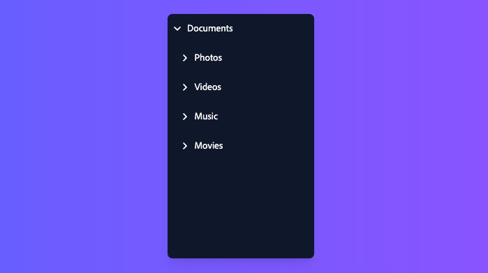
This example's MyTreeItemContent is from the Reusable Wrappers section below.
import {Button, Collection, Tree, TreeItem, TreeItemContent} from 'react-aria-components';

<Tree
  aria-label="Files"
  style={{ height: '300px' }}
  defaultExpandedKeys={['documents', 'photos', 'project']}
  selectionMode="multiple"
  defaultSelectedKeys={['photos']}
>
  <TreeItem id="documents" textValue="Documents">
    <MyTreeItemContent>
      Documents
      <Button aria-label="Info">ⓘ</Button>
    </MyTreeItemContent>
    <TreeItem id="project" textValue="Project">
      <MyTreeItemContent>
        Project
        <Button aria-label="Info">ⓘ</Button>
      </MyTreeItemContent>
      <TreeItem id="report" textValue="Weekly Report">
        <MyTreeItemContent>
          Weekly Report
          <Button aria-label="Info">ⓘ</Button>
        </MyTreeItemContent>
      </TreeItem>
    </TreeItem>
  </TreeItem>
  <TreeItem id="photos" textValue="Photos">
    <MyTreeItemContent>
      Photos
      <Button aria-label="Info">ⓘ</Button>
    </MyTreeItemContent>
    <TreeItem id="one" textValue="Image 1">
      <MyTreeItemContent>
        Image 1
        <Button aria-label="Info">ⓘ</Button>
      </MyTreeItemContent>
    </TreeItem>
    <TreeItem id="two" textValue="Image 2">
      <MyTreeItemContent>
        Image 2
        <Button aria-label="Info">ⓘ</Button>
      </MyTreeItemContent>
    </TreeItem>
  </TreeItem>
</Tree>
import {
Button,
Collection,
Tree,
TreeItem,
TreeItemContent
} from 'react-aria-components';
<Tree
aria-label="Files"
style={{ height: '300px' }}
defaultExpandedKeys={['documents', 'photos', 'project']}
selectionMode="multiple"
defaultSelectedKeys={['photos']}
>
<TreeItem id="documents" textValue="Documents">
<MyTreeItemContent>
Documents
<Button aria-label="Info">ⓘ</Button>
</MyTreeItemContent>
<TreeItem id="project" textValue="Project">
<MyTreeItemContent>
Project
<Button aria-label="Info">ⓘ</Button>
</MyTreeItemContent>
<TreeItem id="report" textValue="Weekly Report">
<MyTreeItemContent>
Weekly Report
<Button aria-label="Info">ⓘ</Button>
</MyTreeItemContent>
</TreeItem>
</TreeItem>
</TreeItem>
<TreeItem id="photos" textValue="Photos">
<MyTreeItemContent>
Photos
<Button aria-label="Info">ⓘ</Button>
</MyTreeItemContent>
<TreeItem id="one" textValue="Image 1">
<MyTreeItemContent>
Image 1
<Button aria-label="Info">ⓘ</Button>
</MyTreeItemContent>
</TreeItem>
<TreeItem id="two" textValue="Image 2">
<MyTreeItemContent>
Image 2
<Button aria-label="Info">ⓘ</Button>
</MyTreeItemContent>
</TreeItem>
</TreeItem>
</Tree>import {
Button,
Collection,
Tree,
TreeItem,
TreeItemContent
} from 'react-aria-components';
<Tree
aria-label="Files"
style={{
height: '300px'
}}
defaultExpandedKeys={[
'documents',
'photos',
'project'
]}
selectionMode="multiple"
defaultSelectedKeys={[
'photos'
]}
>
<TreeItem
id="documents"
textValue="Documents"
>
<MyTreeItemContent>
Documents
<Button aria-label="Info">
ⓘ
</Button>
</MyTreeItemContent>
<TreeItem
id="project"
textValue="Project"
>
<MyTreeItemContent>
Project
<Button aria-label="Info">
ⓘ
</Button>
</MyTreeItemContent>
<TreeItem
id="report"
textValue="Weekly Report"
>
<MyTreeItemContent>
Weekly Report
<Button aria-label="Info">
ⓘ
</Button>
</MyTreeItemContent>
</TreeItem>
</TreeItem>
</TreeItem>
<TreeItem
id="photos"
textValue="Photos"
>
<MyTreeItemContent>
Photos
<Button aria-label="Info">
ⓘ
</Button>
</MyTreeItemContent>
<TreeItem
id="one"
textValue="Image 1"
>
<MyTreeItemContent>
Image 1
<Button aria-label="Info">
ⓘ
</Button>
</MyTreeItemContent>
</TreeItem>
<TreeItem
id="two"
textValue="Image 2"
>
<MyTreeItemContent>
Image 2
<Button aria-label="Info">
ⓘ
</Button>
</MyTreeItemContent>
</TreeItem>
</TreeItem>
</Tree>Show CSS
.react-aria-Tree {
  display: flex;
  flex-direction: column;
  gap: 2px;
  overflow: auto;
  padding: 4px;
  border: 1px solid var(--border-color);
  border-radius: 6px;
  background: var(--overlay-background);
  forced-color-adjust: none;
  outline: none;
  width: 250px;
  max-height: 300px;
  box-sizing: border-box;

  &[data-focus-visible] {
    outline: 2px solid var(--focus-ring-color);
    outline-offset: -1px;
  }

  .react-aria-TreeItem {
    display: flex;
    align-items: center;
    gap: 0.571rem;
    min-height: 28px;
    padding: 0.286rem 0.286rem 0.286rem 0.571rem;
    --padding: 8px;
    border-radius: 6px;
    outline: none;
    cursor: default;
    color: var(--text-color);
    font-size: 1.072rem;
    position: relative;
    transform: translateZ(0);

    .react-aria-Button[slot=chevron] {
      all: unset;
      display: flex;
      visibility: hidden;
      align-items: center;
      justify-content: center;
      width: 1.3rem;
      height: 100%;
      padding-left: calc((var(--tree-item-level) - 1) * var(--padding));

      svg {
        rotate: 0deg;
        transition: rotate 200ms;
        width: 12px;
        height: 12px;
        fill: none;
        stroke: currentColor;
        stroke-width: 3px;
      }
    }

    &[data-has-child-items] .react-aria-Button[slot=chevron] {
      visibility: visible;
    }

    &[data-expanded] .react-aria-Button[slot=chevron] svg {
      rotate: 90deg;
    }

    &[data-focus-visible] {
      outline: 2px solid var(--focus-ring-color);
      outline-offset: -2px;
    }

    &[data-pressed] {
      background: var(--gray-100);
    }

    &[data-selected] {
      background: var(--highlight-background);
      color: var(--highlight-foreground);
      --focus-ring-color: var(--highlight-foreground);

      &[data-focus-visible] {
        outline-color: var(--highlight-foreground);
        outline-offset: -4px;
      }

      .react-aria-Button {
        color: var(--highlight-foreground);
        --highlight-hover: rgb(255 255 255 / 0.1);
        --highlight-pressed: rgb(255 255 255 / 0.2);
      }
    }

    &[data-disabled] {
      color: var(--text-color-disabled);
    }

    .react-aria-Button:not([slot]) {
      margin-left: auto;
      background: transparent;
      border: none;
      font-size: 1.2rem;
      line-height: 1.2em;
      padding: 0.286rem 0.429rem;
      transition: background 200ms;

      &[data-hovered] {
        background: var(--highlight-hover);
      }

      &[data-pressed] {
        background: var(--highlight-pressed);
        box-shadow: none;
      }
    }
  }

  /* join selected items if :has selector is supported */
  @supports selector(:has(.foo)) {
    gap: 0;

    .react-aria-TreeItem[data-selected]:has(+ [data-selected]) {
      border-end-start-radius: 0;
      border-end-end-radius: 0;
    }

    .react-aria-TreeItem[data-selected] + [data-selected] {
      border-start-start-radius: 0;
      border-start-end-radius: 0;
    }
  }

  :where(.react-aria-TreeItem) .react-aria-Checkbox {
    --selected-color: var(--highlight-foreground);
    --selected-color-pressed: var(--highlight-foreground-pressed);
    --checkmark-color: var(--highlight-background);
    --background-color: var(--highlight-background);
  }
}.react-aria-Tree {
display: flex;
flex-direction: column;
gap: 2px;
overflow: auto;
padding: 4px;
border: 1px solid var(--border-color);
border-radius: 6px;
background: var(--overlay-background);
forced-color-adjust: none;
outline: none;
width: 250px;
max-height: 300px;
box-sizing: border-box;
&[data-focus-visible] {
outline: 2px solid var(--focus-ring-color);
outline-offset: -1px;
}
.react-aria-TreeItem {
display: flex;
align-items: center;
gap: 0.571rem;
min-height: 28px;
padding: 0.286rem 0.286rem 0.286rem 0.571rem;
--padding: 8px;
border-radius: 6px;
outline: none;
cursor: default;
color: var(--text-color);
font-size: 1.072rem;
position: relative;
transform: translateZ(0);
.react-aria-Button[slot=chevron] {
all: unset;
display: flex;
visibility: hidden;
align-items: center;
justify-content: center;
width: 1.3rem;
height: 100%;
padding-left: calc((var(--tree-item-level) - 1) * var(--padding));
svg {
rotate: 0deg;
transition: rotate 200ms;
width: 12px;
height: 12px;
fill: none;
stroke: currentColor;
stroke-width: 3px;
}
}
&[data-has-child-items] .react-aria-Button[slot=chevron] {
visibility: visible;
}
&[data-expanded] .react-aria-Button[slot=chevron] svg {
rotate: 90deg;
}
&[data-focus-visible] {
outline: 2px solid var(--focus-ring-color);
outline-offset: -2px;
}
&[data-pressed] {
background: var(--gray-100);
}
&[data-selected] {
background: var(--highlight-background);
color: var(--highlight-foreground);
--focus-ring-color: var(--highlight-foreground);
&[data-focus-visible] {
outline-color: var(--highlight-foreground);
outline-offset: -4px;
}
.react-aria-Button {
color: var(--highlight-foreground);
--highlight-hover: rgb(255 255 255 / 0.1);
--highlight-pressed: rgb(255 255 255 / 0.2);
}
}
&[data-disabled] {
color: var(--text-color-disabled);
}
.react-aria-Button:not([slot]) {
margin-left: auto;
background: transparent;
border: none;
font-size: 1.2rem;
line-height: 1.2em;
padding: 0.286rem 0.429rem;
transition: background 200ms;
&[data-hovered] {
background: var(--highlight-hover);
}
&[data-pressed] {
background: var(--highlight-pressed);
box-shadow: none;
}
}
}
/* join selected items if :has selector is supported */
@supports selector(:has(.foo)) {
gap: 0;
.react-aria-TreeItem[data-selected]:has(+ [data-selected]) {
border-end-start-radius: 0;
border-end-end-radius: 0;
}
.react-aria-TreeItem[data-selected] + [data-selected] {
border-start-start-radius: 0;
border-start-end-radius: 0;
}
}
:where(.react-aria-TreeItem) .react-aria-Checkbox {
--selected-color: var(--highlight-foreground);
--selected-color-pressed: var(--highlight-foreground-pressed);
--checkmark-color: var(--highlight-background);
--background-color: var(--highlight-background);
}
}Features#
A tree can be built using the <ul>, <li>,
and <ol>, but is very limited in functionality especially when it comes to user interactions.
HTML lists are meant for static content, rather than heirarchies with rich interactions like focusable elements within cells, keyboard navigation, item selection, sorting, etc.
Tree helps achieve accessible and interactive tree components that can be styled as needed.
- Item selection – Single or multiple selection, with optional checkboxes, disabled items, and both
toggleandreplaceselection behaviors. - Interactive children – Tree items may include interactive elements such as buttons, menus, etc.
- Actions – Items support optional actions such as navigation via click, tap, double click, or Enter key.
- Keyboard navigation – Tree items and focusable children can be navigated using the arrow keys, along with page up/down, home/end, etc. Typeahead, auto scrolling, and selection modifier keys are supported as well.
- Virtualized scrolling – Use Virtualizer to improve performance of large lists by rendering only the visible items.
- Touch friendly – Selection and actions adapt their behavior depending on the device. For example, selection is activated via long press on touch when item actions are present.
- Accessible – Follows the ARIA treegrid pattern, with additional selection announcements via an ARIA live region. Extensively tested across many devices and assistive technologies to ensure announcements and behaviors are consistent.
Anatomy#
A Tree consists of a container element, with items containing data inside. The items within a tree may contain focusable elements or plain text content. Each item may also contain a button to toggle the expandable state of that item.
If the tree supports item selection, each item can optionally include a selection checkbox.
import {Button, Checkbox, Tree, TreeItem, TreeItemContent} from 'react-aria-components';

<Tree>
  <TreeItem>
    <TreeItemContent>
      <Button slot="chevron" />
      <Checkbox slot="selection" />
    </TreeItemContent>
    <TreeItem>
      {/* ... */}
    </TreeItem>
  </TreeItem>
</Tree>
import {
Button,
Checkbox,
Tree,
TreeItem,
TreeItemContent
} from 'react-aria-components';
<Tree>
<TreeItem>
<TreeItemContent>
<Button slot="chevron" />
<Checkbox slot="selection" />
</TreeItemContent>
<TreeItem>
{/* ... */}
</TreeItem>
</TreeItem>
</Tree>import {
Button,
Checkbox,
Tree,
TreeItem,
TreeItemContent
} from 'react-aria-components';
<Tree>
<TreeItem>
<TreeItemContent>
<Button slot="chevron" />
<Checkbox slot="selection" />
</TreeItemContent>
<TreeItem>
{/* ... */}
</TreeItem>
</TreeItem>
</Tree>Concepts#
Tree makes use of the following concepts:
Composed components#
A Tree uses the following components, which may also be used standalone or reused in other components.
Examples#
Starter kits#
To help kick-start your project, we offer starter kits that include example implementations of all React Aria components with various styling solutions. All components are fully styled, including support for dark mode, high contrast mode, and all UI states. Each starter comes with a pre-configured Storybook that you can experiment with, or use as a starting point for your own component library.
Reusable wrappers#
If you will use a Tree in multiple places in your app, you can wrap all of the pieces into a reusable component. This way, the DOM structure, styling code, and other logic are defined in a single place and reused everywhere to ensure consistency.
import type {TreeItemContentProps, TreeItemContentRenderProps} from 'react-aria-components';
import {Button} from 'react-aria-components';

function MyTreeItemContent(props: TreeItemContentProps) {
  return (
    <TreeItemContent>
      {(
        { hasChildItems, selectionBehavior, selectionMode }:
          TreeItemContentRenderProps
      ) => (
        <>
          {selectionBehavior === 'toggle' && selectionMode !== 'none' && (
            <MyCheckbox slot="selection" />
          )}
          <Button slot="chevron">
            <svg viewBox="0 0 24 24">
              <path d="m8.25 4.5 7.5 7.5-7.5 7.5" />
            </svg>
          </Button>
          {props.children}
        </>
      )}
    </TreeItemContent>
  );
}
import type {
  TreeItemContentProps,
  TreeItemContentRenderProps
} from 'react-aria-components';
import {Button} from 'react-aria-components';

function MyTreeItemContent(props: TreeItemContentProps) {
  return (
    <TreeItemContent>
      {(
        { hasChildItems, selectionBehavior, selectionMode }:
          TreeItemContentRenderProps
      ) => (
        <>
          {selectionBehavior === 'toggle' &&
            selectionMode !== 'none' && (
            <MyCheckbox slot="selection" />
          )}
          <Button slot="chevron">
            <svg viewBox="0 0 24 24">
              <path d="m8.25 4.5 7.5 7.5-7.5 7.5" />
            </svg>
          </Button>
          {props.children}
        </>
      )}
    </TreeItemContent>
  );
}
import type {
  TreeItemContentProps,
  TreeItemContentRenderProps
} from 'react-aria-components';
import {Button} from 'react-aria-components';

function MyTreeItemContent(
  props:
    TreeItemContentProps
) {
  return (
    <TreeItemContent>
      {(
        {
          hasChildItems,
          selectionBehavior,
          selectionMode
        }: TreeItemContentRenderProps
      ) => (
        <>
          {selectionBehavior ===
              'toggle' &&
            selectionMode !==
              'none' &&
            (
              <MyCheckbox slot="selection" />
            )}
          <Button slot="chevron">
            <svg viewBox="0 0 24 24">
              <path d="m8.25 4.5 7.5 7.5-7.5 7.5" />
            </svg>
          </Button>
          {props
            .children}
        </>
      )}
    </TreeItemContent>
  );
}
The TreeItem can also be wrapped. This example accepts a title prop and renders the TreeItemContent automatically.
import {TreeItemProps} from 'react-aria-components';

interface MyTreeItemProps extends Partial<TreeItemProps> {
  title: string
}

function MyTreeItem(props: MyTreeItemProps) {
  return (
    <TreeItem textValue={props.title} {...props}>
      <MyTreeItemContent>
        {props.title}
      </MyTreeItemContent>
      {props.children}
    </TreeItem>
  );
}
import {TreeItemProps} from 'react-aria-components';
interface MyTreeItemProps extends Partial<TreeItemProps> {
title: string
}
function MyTreeItem(props: MyTreeItemProps) {
return (
<TreeItem textValue={props.title} {...props}>
<MyTreeItemContent>
{props.title}
</MyTreeItemContent>
{props.children}
</TreeItem>
);
}import {TreeItemProps} from 'react-aria-components';
interface MyTreeItemProps
extends
Partial<
TreeItemProps
> {
title: string;
}
function MyTreeItem(
props: MyTreeItemProps
) {
return (
<TreeItem
textValue={props
.title}
{...props}
>
<MyTreeItemContent>
{props.title}
</MyTreeItemContent>
{props.children}
</TreeItem>
);
}
Now we can render a Tree using far less code.
<Tree
  aria-label="Files"
  style={{ height: '300px' }}
  defaultExpandedKeys={['documents', 'photos', 'project']}
>
  <MyTreeItem title="Documents">
    <MyTreeItem title="Project">
      <MyTreeItem title="Weekly Report" />
    </MyTreeItem>
  </MyTreeItem>
  <MyTreeItem title="Photos">
    <MyTreeItem title="Image 1" />
    <MyTreeItem title="Image 2" />
  </MyTreeItem>
</Tree><Tree
aria-label="Files"
style={{ height: '300px' }}
defaultExpandedKeys={['documents', 'photos', 'project']}
>
<MyTreeItem title="Documents">
<MyTreeItem title="Project">
<MyTreeItem title="Weekly Report" />
</MyTreeItem>
</MyTreeItem>
<MyTreeItem title="Photos">
<MyTreeItem title="Image 1" />
<MyTreeItem title="Image 2" />
</MyTreeItem>
</Tree><Tree
aria-label="Files"
style={{
height: '300px'
}}
defaultExpandedKeys={[
'documents',
'photos',
'project'
]}
>
<MyTreeItem title="Documents">
<MyTreeItem title="Project">
<MyTreeItem title="Weekly Report" />
</MyTreeItem>
</MyTreeItem>
<MyTreeItem title="Photos">
<MyTreeItem title="Image 1" />
<MyTreeItem title="Image 2" />
</MyTreeItem>
</Tree>Content#
So far, our examples have shown static collections where the data is hard coded. Dynamic collections, as shown below, can be used when the tree data comes from an external data source such as an API, or updates over time. In the example below, data for each item is provided to the tree via a render function.
import type {TreeProps} from 'react-aria-components';
import {MyCheckbox} from './Checkbox';
let items = [
{id: 1, title: 'Documents', children: [
{id: 2, title: 'Project', children: [
{id: 3, title: 'Weekly Report', children: []}
]}
]},
{id: 4, title: 'Photos', children: [
{id: 5, title: 'Image 1', children: []},
{id: 6, title: 'Image 2', children: []}
]}
];
interface FileType {
id: number,
title: string,
children: FileType[]
}
function FileTree(props: TreeProps<FileType>) {
return (
<Tree
aria-label="Files"
defaultExpandedKeys={[1, 4]}
items={items} selectionMode="multiple"
{...props}>
{function renderItem(item) { return (
<TreeItem textValue={item.title}>
<MyTreeItemContent>
{item.title}
<Button
aria-label="Info"
onPress={() => alert(`Info for ...`)}>
ⓘ
</Button>
</MyTreeItemContent>
<Collection items={item.children}>
{/* recursively render children */}
{renderItem} </Collection>
</TreeItem>
);
}}
</Tree>
)
}import type {TreeProps} from 'react-aria-components';
import {MyCheckbox} from './Checkbox';
let items = [
{
id: 1,
title: 'Documents',
children: [
{
id: 2,
title: 'Project',
children: [
{ id: 3, title: 'Weekly Report', children: [] }
]
}
]
},
{
id: 4,
title: 'Photos',
children: [
{ id: 5, title: 'Image 1', children: [] },
{ id: 6, title: 'Image 2', children: [] }
]
}
];
interface FileType {
id: number;
title: string;
children: FileType[];
}
function FileTree(props: TreeProps<FileType>) {
return (
<Tree
aria-label="Files"
defaultExpandedKeys={[1, 4]}
items={items} selectionMode="multiple"
{...props}
>
{function renderItem(item) { return (
<TreeItem textValue={item.title}>
<MyTreeItemContent>
{item.title}
<Button
aria-label="Info"
onPress={() =>
alert(`Info for ...`)}
>
ⓘ
</Button>
</MyTreeItemContent>
<Collection items={item.children}>
{/* recursively render children */}
{renderItem} </Collection>
</TreeItem>
);
}}
</Tree>
);
}
import type {TreeProps} from 'react-aria-components';
import {MyCheckbox} from './Checkbox';
let items = [
{
id: 1,
title: 'Documents',
children: [
{
id: 2,
title: 'Project',
children: [
{
id: 3,
title:
'Weekly Report',
children: []
}
]
}
]
},
{
id: 4,
title: 'Photos',
children: [
{
id: 5,
title: 'Image 1',
children: []
},
{
id: 6,
title: 'Image 2',
children: []
}
]
}
];
interface FileType {
id: number;
title: string;
children: FileType[];
}
function FileTree(
props: TreeProps<
FileType
>
) {
return (
<Tree
aria-label="Files"
defaultExpandedKeys={[
1,
4
]}
items={items} selectionMode="multiple"
{...props}
>
{function renderItem(
item
) { return (
<TreeItem
textValue={item
.title}
>
<MyTreeItemContent>
{item
.title}
<Button
aria-label="Info"
onPress={() =>
alert(
`Info for ...`
)}
>
ⓘ
</Button>
</MyTreeItemContent>
<Collection
items={item
.children}
>
{/* recursively render children */}
{renderItem} </Collection>
</TreeItem>
);
}}
</Tree>
);
}
Selection#
Single selection#
By default, Tree doesn't allow item selection but this can be enabled using the selectionMode prop. Use defaultSelectedKeys to provide a default set of selected items.
Note that the value of the selected keys must match the id prop of the item.
The example below enables single selection mode and uses defaultSelectedKeys to select the item with id equal to 2.
A user can click on a different item to change the selection or click on the same item again to deselect it entirely.
// Using the example above
<FileTree
  selectionMode="single"
  defaultSelectedKeys={[2]}
  defaultExpandedKeys={[1]}
/>
// Using the example above
<FileTree
selectionMode="single"
defaultSelectedKeys={[2]}
defaultExpandedKeys={[1]}
/>// Using the example above
<FileTree
selectionMode="single"
defaultSelectedKeys={[
2
]}
defaultExpandedKeys={[
1
]}
/>Multiple selection#
Multiple selection can be enabled by setting selectionMode to multiple.
// Using the example above
<FileTree
  selectionMode="multiple"
  defaultSelectedKeys={[2, 4]}
  defaultExpandedKeys={[1]}
/>
// Using the example above
<FileTree
selectionMode="multiple"
defaultSelectedKeys={[2, 4]}
defaultExpandedKeys={[1]}
/>// Using the example above
<FileTree
selectionMode="multiple"
defaultSelectedKeys={[
2,
4
]}
defaultExpandedKeys={[
1
]}
/>Disallow empty selection#
Tree also supports a disallowEmptySelection prop which forces the user to have at least one item in the Tree selected at all times.
In this mode, if a single item is selected and the user presses it, it will not be deselected.
// Using the example above
<FileTree
  selectionMode="single"
  defaultSelectedKeys={[2]}
  defaultExpandedKeys={[1]}
  disallowEmptySelection
/>
// Using the example above
<FileTree
selectionMode="single"
defaultSelectedKeys={[2]}
defaultExpandedKeys={[1]}
disallowEmptySelection
/>// Using the example above
<FileTree
selectionMode="single"
defaultSelectedKeys={[
2
]}
defaultExpandedKeys={[
1
]}
disallowEmptySelection
/>Controlled selection#
To programmatically control item selection, use the selectedKeys prop paired with the onSelectionChange callback. The id prop from the selected items will
be passed into the callback when the item is pressed, allowing you to update state accordingly.
import type {Selection} from 'react-aria-components';

interface Pokemon {
  id: number,
  name: string,
  children?: Pokemon[]
}

interface PokemonEvolutionTreeProps<T> extends TreeProps<T> {
  items?: T[],
  renderEmptyState?: () => string
}

function PokemonEvolutionTree(
  props: PokemonEvolutionTreeProps<Pokemon>
) {
  let items: Pokemon[] = props.items ?? [
    {id: 1, name: 'Bulbasaur', children: [
      {id: 2, name: 'Ivysaur', children: [
        {id: 3, name: 'Venusaur'}
      ]}
    ]},
    {id: 4, name: 'Charmander', children: [
      {id: 5, name: 'Charmeleon', children: [
        {id: 6, name: 'Charizard'}
      ]}
    ]},
    {id: 7, name: 'Squirtle', children: [
      {id: 8, name: 'Wartortle', children: [
        {id: 9, name: 'Blastoise'}
      ]}
    ]}
  ];

  let [selectedKeys, setSelectedKeys] =
    React.useState<Selection>(new Set());
  return (
    <Tree
      aria-label="Pokemon evolution tree"
      style={{height: '300px'}}
      items={items}
      defaultExpandedKeys={[1, 2]}
      selectedKeys={selectedKeys}
      onSelectionChange={setSelectedKeys}      {...props}
    >
      {function renderItem(item) {
        return (
          <MyTreeItem title={item.name}>
            <Collection items={item.children}>
              {renderItem}
            </Collection>
          </MyTreeItem>
        );
      }}
    </Tree>
  );
}

<PokemonEvolutionTree selectionMode="multiple" />
import type {Selection} from 'react-aria-components';
interface Pokemon {
id: number;
name: string;
children?: Pokemon[];
}
interface PokemonEvolutionTreeProps<T>
extends TreeProps<T> {
items?: T[];
renderEmptyState?: () => string;
}
function PokemonEvolutionTree(
props: PokemonEvolutionTreeProps<Pokemon>
) {
let items: Pokemon[] = props.items ?? [
{
id: 1,
name: 'Bulbasaur',
children: [
{
id: 2,
name: 'Ivysaur',
children: [
{ id: 3, name: 'Venusaur' }
]
}
]
},
{
id: 4,
name: 'Charmander',
children: [
{
id: 5,
name: 'Charmeleon',
children: [
{ id: 6, name: 'Charizard' }
]
}
]
},
{
id: 7,
name: 'Squirtle',
children: [
{
id: 8,
name: 'Wartortle',
children: [
{ id: 9, name: 'Blastoise' }
]
}
]
}
];
let [selectedKeys, setSelectedKeys] = React.useState<
Selection
>(new Set());
return (
<Tree
aria-label="Pokemon evolution tree"
style={{ height: '300px' }}
items={items}
defaultExpandedKeys={[1, 2]}
selectedKeys={selectedKeys}
onSelectionChange={setSelectedKeys} ...props}
>
{function renderItem(item) {
return (
<MyTreeItem title={item.name}>
<Collection items={item.children}>
{renderItem}
</Collection>
</MyTreeItem>
);
}}
</Tree>
);
}
<PokemonEvolutionTree selectionMode="multiple" />import type {Selection} from 'react-aria-components';
interface Pokemon {
id: number;
name: string;
children?: Pokemon[];
}
interface PokemonEvolutionTreeProps<
T
> extends TreeProps<T> {
items?: T[];
renderEmptyState?:
() => string;
}
function PokemonEvolutionTree(
props:
PokemonEvolutionTreeProps<
Pokemon
>
) {
let items: Pokemon[] =
props.items ?? [
{
id: 1,
name:
'Bulbasaur',
children: [
{
id: 2,
name:
'Ivysaur',
children: [
{
id: 3,
name:
'Venusaur'
}
]
}
]
},
{
id: 4,
name:
'Charmander',
children: [
{
id: 5,
name:
'Charmeleon',
children: [
{
id: 6,
name:
'Charizard'
}
]
}
]
},
{
id: 7,
name: 'Squirtle',
children: [
{
id: 8,
name:
'Wartortle',
children: [
{
id: 9,
name:
'Blastoise'
}
]
}
]
}
];
let [
selectedKeys,
setSelectedKeys
] = React.useState<
Selection
>(new Set());
return (
<Tree
aria-label="Pokemon evolution tree"
style={{
height: '300px'
}}
items={items}
defaultExpandedKeys={[
1,
2
]}
selectedKeys={selectedKeys}
onSelectionChange={setSelectedKeys} ...props}
>
{function renderItem(
item
) {
return (
<MyTreeItem
title={item
.name}
>
<Collection
items={item
.children}
>
{renderItem}
</Collection>
</MyTreeItem>
);
}}
</Tree>
);
}
<PokemonEvolutionTree selectionMode="multiple" />Selection behavior#
By default, Tree uses the "toggle" selection behavior, which behaves like a checkbox group: clicking, tapping, or pressing the Space or Enter keys toggles selection for the focused item. Using the arrow keys moves focus but does not change selection. The "toggle" selection mode is often paired with checkboxes in each item as an explicit affordance for selection.
When the selectionBehavior prop is set to "replace", clicking an item with the mouse replaces the selection with only that item. Using the arrow keys moves both focus and selection. To select multiple items, modifier keys such as Ctrl, Cmd, and Shift can be used. To move focus without moving selection, the Ctrl key on Windows or the Option key on macOS can be held while pressing the arrow keys. Holding this modifier while pressing the Space key toggles selection for the focused item, which allows multiple selection of non-contiguous items. On touch screen devices, selection always behaves as toggle since modifier keys may not be available. This behavior emulates native platforms such as macOS and Windows and is often used when checkboxes in each item are not desired.
<PokemonEvolutionTree selectionMode="multiple" selectionBehavior="replace" /><PokemonEvolutionTree
selectionMode="multiple"
selectionBehavior="replace"
/><PokemonEvolutionTree
selectionMode="multiple"
selectionBehavior="replace"
/>Item actions#
Tree supports item actions via the onAction prop, which is useful for functionality such as navigation. In the default "toggle" selection behavior, when nothing is selected, clicking or tapping the item triggers the item action.
When at least one item is selected, the tree is in selection mode, and clicking or tapping an item toggles the selection. Actions may also be triggered via the Enter key, and selection using the Space key.
This behavior is slightly different in the "replace" selection behavior, where single clicking selects the item and actions are performed via double click. On touch devices, the action becomes the primary tap interaction,
and a long press enters into selection mode, which temporarily swaps the selection behavior to "toggle" to perform selection (you may wish to display checkboxes when this happens). Deselecting all items exits selection mode
and reverts the selection behavior back to "replace". Keyboard behaviors are unaffected.
<div style={{display: 'flex', flexWrap: 'wrap', gap: '24px'}}>
<PokemonEvolutionTree
aria-label="Pokemon tree with item actions and toggle selection behavior"
onAction={key => alert(`Opening item ...`)} selectionMode="multiple" />
<PokemonEvolutionTree
aria-label="Pokemon tree with item actions and replace selection behavior"
onAction={key => alert(`Opening item ...`)}
selectionBehavior="replace" selectionMode="multiple" />
</div><div
style={{
display: 'flex',
flexWrap: 'wrap',
gap: '24px'
}}
>
<PokemonEvolutionTree
aria-label="Pokemon tree with item actions and toggle selection behavior"
onAction={(key) => alert(`Opening item ...`)} selectionMode="multiple"
/>
<PokemonEvolutionTree
aria-label="Pokemon tree with item actions and replace selection behavior"
onAction={(key) => alert(`Opening item ...`)}
selectionBehavior="replace" selectionMode="multiple"
/>
</div><div
style={{
display: 'flex',
flexWrap: 'wrap',
gap: '24px'
}}
>
<PokemonEvolutionTree
aria-label="Pokemon tree with item actions and toggle selection behavior"
onAction={(key) =>
alert(
`Opening item ...`
)} selectionMode="multiple"
/>
<PokemonEvolutionTree
aria-label="Pokemon tree with item actions and replace selection behavior"
onAction={(key) =>
alert(
`Opening item ...`
)}
selectionBehavior="replace" selectionMode="multiple"
/>
</div>Items may also have an action specified by directly applying onAction on the TreeItem itself. This may be especially convenient in static collections. If onAction is also provided to the Tree, both the tree's and the item's onAction are called.
<Tree
  aria-label="Tree with onAction applied on the items directly"
  style={{ height: '300px' }}
  defaultExpandedKeys={['bulbasaur', 'ivysaur']}
>
  <MyTreeItem
    onAction={() => alert(`Opening Bulbasaur...`)}    id="bulbasaur"
    title="Bulbasaur"
  >
    <MyTreeItem
      onAction={() => alert(`Opening Ivysaur...`)}
      id="ivysaur"
      title="Ivysaur"
    >
      <MyTreeItem
        onAction={() => alert(`Opening Venisaur...`)}
        id="venisaur"
        title="Venisaur"
      />
    </MyTreeItem>
  </MyTreeItem>
</Tree><Tree
aria-label="Tree with onAction applied on the items directly"
style={{ height: '300px' }}
defaultExpandedKeys={['bulbasaur', 'ivysaur']}
>
<MyTreeItem
onAction={() => alert(`Opening Bulbasaur...`)} id="bulbasaur"
title="Bulbasaur"
>
<MyTreeItem
onAction={() => alert(`Opening Ivysaur...`)}
id="ivysaur"
title="Ivysaur"
>
<MyTreeItem
onAction={() => alert(`Opening Venisaur...`)}
id="venisaur"
title="Venisaur"
/>
</MyTreeItem>
</MyTreeItem>
</Tree><Tree
aria-label="Tree with onAction applied on the items directly"
style={{
height: '300px'
}}
defaultExpandedKeys={[
'bulbasaur',
'ivysaur'
]}
>
<MyTreeItem
onAction={() =>
alert(
`Opening Bulbasaur...`
)} id="bulbasaur"
title="Bulbasaur"
>
<MyTreeItem
onAction={() =>
alert(
`Opening Ivysaur...`
)}
id="ivysaur"
title="Ivysaur"
>
<MyTreeItem
onAction={() =>
alert(
`Opening Venisaur...`
)}
id="venisaur"
title="Venisaur"
/>
</MyTreeItem>
</MyTreeItem>
</Tree>Links#
Tree items may also be links to another page or website. This can be achieved by passing the href prop to the <TreeItem> component. Links behave the same way as described above for item actions depending on the selectionMode and selectionBehavior.
<Tree
  aria-label="Tree with onAction applied on the items directly"
  style={{ height: '200px' }}
  defaultExpandedKeys={['bulbasaur', 'ivysaur']}
>
  <MyTreeItem
    href="https://pokemondb.net/pokedex/bulbasaur"
    target="_blank"    id="bulbasaur"
    title="Bulbasaur"
  >
    <MyTreeItem
      id="ivysaur"
      title="Ivysaur"
      href="https://pokemondb.net/pokedex/ivysaur"
      target="_blank"
    >
      <MyTreeItem
        id="venisaur"
        title="Venisaur"
        href="https://pokemondb.net/pokedex/venusaur"
        target="_blank"
      />
    </MyTreeItem>
  </MyTreeItem>
</Tree><Tree
aria-label="Tree with onAction applied on the items directly"
style={{ height: '200px' }}
defaultExpandedKeys={['bulbasaur', 'ivysaur']}
>
<MyTreeItem
href="https://pokemondb.net/pokedex/bulbasaur"
target="_blank" id="bulbasaur"
title="Bulbasaur"
>
<MyTreeItem
id="ivysaur"
title="Ivysaur"
href="https://pokemondb.net/pokedex/ivysaur"
target="_blank"
>
<MyTreeItem
id="venisaur"
title="Venisaur"
href="https://pokemondb.net/pokedex/venusaur"
target="_blank"
/>
</MyTreeItem>
</MyTreeItem>
</Tree><Tree
aria-label="Tree with onAction applied on the items directly"
style={{
height: '200px'
}}
defaultExpandedKeys={[
'bulbasaur',
'ivysaur'
]}
>
<MyTreeItem
href="https://pokemondb.net/pokedex/bulbasaur"
target="_blank" id="bulbasaur"
title="Bulbasaur"
>
<MyTreeItem
id="ivysaur"
title="Ivysaur"
href="https://pokemondb.net/pokedex/ivysaur"
target="_blank"
>
<MyTreeItem
id="venisaur"
title="Venisaur"
href="https://pokemondb.net/pokedex/venusaur"
target="_blank"
/>
</MyTreeItem>
</MyTreeItem>
</Tree>Client side routing#
The <TreeItem> component works with frameworks and client side routers like Next.js and React Router. As with other React Aria components that support links, this works via the RouterProvider component at the root of your app. See the client side routing guide to learn how to set this up.
Disabled items#
A TreeItem can be disabled with the isDisabled prop. This will disable all interactions on the item
unless the disabledBehavior prop on Tree is used to change this behavior.
Note that you are responsible for the styling of disabled items, however, the selection checkbox will be automatically disabled.
<Tree
  aria-label="Tree with disabled items"
  style={{ height: '100px' }}
  defaultExpandedKeys={['bulbasaur']}
>
  <MyTreeItem id="bulbasaur" title="Bulbasaur">
    <MyTreeItem id="ivysaur" title="Ivysaur" isDisabled>      <MyTreeItem id="venisaur" title="Venisaur" />
    </MyTreeItem>
  </MyTreeItem>
</Tree><Tree
aria-label="Tree with disabled items"
style={{ height: '100px' }}
defaultExpandedKeys={['bulbasaur']}
>
<MyTreeItem id="bulbasaur" title="Bulbasaur">
<MyTreeItem id="ivysaur" title="Ivysaur" isDisabled> <MyTreeItem id="venisaur" title="Venisaur" />
</MyTreeItem>
</MyTreeItem>
</Tree><Tree
aria-label="Tree with disabled items"
style={{
height: '100px'
}}
defaultExpandedKeys={[
'bulbasaur'
]}
>
<MyTreeItem
id="bulbasaur"
title="Bulbasaur"
>
<MyTreeItem
id="ivysaur"
title="Ivysaur"
isDisabled
> <MyTreeItem
id="venisaur"
title="Venisaur"
/>
</MyTreeItem>
</MyTreeItem>
</Tree>When disabledBehavior is set to selection, interactions such as focus, dragging, or actions can still be performed on disabled rows.
<Tree
  aria-label="Tree with disabled items"
  style={{height: '100px'}}
  selectionMode="multiple"
  defaultExpandedKeys={['bulbasaur']}
  disabledBehavior="selection">
  <MyTreeItem id="bulbasaur" title="Bulbasaur">
    <MyTreeItem id="ivysaur" title="Ivysaur" isDisabled>      <MyTreeItem id="venisaur" title="Venisaur" />
    </MyTreeItem>
  </MyTreeItem>
</Tree><Tree
aria-label="Tree with disabled items"
style={{height: '100px'}}
selectionMode="multiple"
defaultExpandedKeys={['bulbasaur']}
disabledBehavior="selection">
<MyTreeItem id="bulbasaur" title="Bulbasaur">
<MyTreeItem id="ivysaur" title="Ivysaur" isDisabled> <MyTreeItem id="venisaur" title="Venisaur" />
</MyTreeItem>
</MyTreeItem>
</Tree><Tree
aria-label="Tree with disabled items"
style={{
height: '100px'
}}
selectionMode="multiple"
defaultExpandedKeys={[
'bulbasaur'
]}
disabledBehavior="selection">
<MyTreeItem
id="bulbasaur"
title="Bulbasaur"
>
<MyTreeItem
id="ivysaur"
title="Ivysaur"
isDisabled
> <MyTreeItem
id="venisaur"
title="Venisaur"
/>
</MyTreeItem>
</MyTreeItem>
</Tree>In dynamic collections, it may be more convenient to use the disabledKeys prop at the Tree level instead of isDisabled on individual items.
This accepts a list of item ids that are disabled. An item is considered disabled if its key exists in disabledKeys or if it has isDisabled.
// Using the same tree as above
<PokemonEvolutionTree selectionMode="multiple" disabledKeys={[3]} />
// Using the same tree as above
<PokemonEvolutionTree
selectionMode="multiple"
disabledKeys={[3]}
/>// Using the same tree as above
<PokemonEvolutionTree
selectionMode="multiple"
disabledKeys={[3]}
/>Empty state#
Use the renderEmptyState prop to customize what the Tree will display if there are no items.
<Tree
  aria-label="Search results"
  renderEmptyState={() => 'No results found.'}
  style={{ height: '100px' }}
>
  {[]}
</Tree><Tree
aria-label="Search results"
renderEmptyState={() => 'No results found.'}
style={{ height: '100px' }}
>
{[]}
</Tree><Tree
aria-label="Search results"
renderEmptyState={() =>
'No results found.'}
style={{
height: '100px'
}}
>
{[]}
</Tree>Show CSS
.react-aria-Tree {
  &[data-empty] {
    display: flex;
    align-items: center;
    justify-content: center;
    font-style: italic;
  }
}.react-aria-Tree {
&[data-empty] {
display: flex;
align-items: center;
justify-content: center;
font-style: italic;
}
}.react-aria-Tree {
&[data-empty] {
display: flex;
align-items: center;
justify-content: center;
font-style: italic;
}
}Props#
Tree#
| Name | Type | Default | Description |
selectionBehavior | SelectionBehavior | — | How multiple selection should behave in the tree. |
renderEmptyState | (
(props: TreeEmptyStateRenderProps
)) => ReactNode | — | Provides content to display when there are no items in the list. |
disabledBehavior | DisabledBehavior | 'all' | Whether disabledKeys applies to all interactions, or only selection. |
autoFocus | boolean | FocusStrategy | — | Whether to auto focus the gridlist or an option. |
items | Iterable<T> | — | Item objects in the collection. |
disabledKeys | Iterable<Key> | — | The item keys that are disabled. These items cannot be selected, focused, or otherwise interacted with. |
selectionMode | SelectionMode | — | The type of selection that is allowed in the collection. |
disallowEmptySelection | boolean | — | Whether the collection allows empty selection. |
selectedKeys | 'all' | Iterable<Key> | — | The currently selected keys in the collection (controlled). |
defaultSelectedKeys | 'all' | Iterable<Key> | — | The initial selected keys in the collection (uncontrolled). |
children | ReactNode | (
(item: object
)) => ReactNode | — | The contents of the collection. |
dependencies | ReadonlyArray<any> | — | Values that should invalidate the item cache when using dynamic collections. |
className | string | (
(values: TreeRenderProps
& & {}
)) => string | — | The CSS className for the element. A function may be provided to compute the class based on component state. |
style | CSSProperties | (
(values: TreeRenderProps
& & {}
)) => CSSProperties | undefined | — | The inline style for the element. A function may be provided to compute the style based on component state. |
expandedKeys | Iterable<Key> | — | The currently expanded keys in the collection (controlled). |
defaultExpandedKeys | Iterable<Key> | — | The initial expanded keys in the collection (uncontrolled). |
Events
| Name | Type | Description |
onAction | (
(key: Key
)) => void | Handler that is called when a user performs an action on an item. The exact user event depends on
the collection's |
onSelectionChange | (
(keys: Selection
)) => void | Handler that is called when the selection changes. |
onScroll | (
(e: UIEvent<Element>
)) => void | Handler that is called when a user scrolls. See MDN. |
onExpandedChange | (
(keys: Set<Key>
)) => any | Handler that is called when items are expanded or collapsed. |
Layout
| Name | Type | Description |
slot | string | null | A slot name for the component. Slots allow the component to receive props from a parent component.
An explicit |
Accessibility
| Name | Type | Description |
id | string | The element's unique identifier. See MDN. |
aria-label | string | Defines a string value that labels the current element. |
aria-labelledby | string | Identifies the element (or elements) that labels the current element. |
aria-describedby | string | Identifies the element (or elements) that describes the object. |
aria-details | string | Identifies the element (or elements) that provide a detailed, extended description for the object. |
TreeItem#
| Name | Type | Description |
textValue | string | A string representation of the tree item's contents, used for features like typeahead. |
children | ReactNode | The content of the tree item along with any nested children. Supports static nested tree items or use of a Collection to dynamically render nested tree items. |
id | Key | The unique id of the tree row. |
value | object | The object value that this tree item represents. When using dynamic collections, this is set automatically. |
isDisabled | boolean | Whether the item is disabled. |
className | string | (
(values: TreeItemRenderProps
& & {}
)) => string | The CSS className for the element. A function may be provided to compute the class based on component state. |
style | CSSProperties | (
(values: TreeItemRenderProps
& & {}
)) => CSSProperties | undefined | The inline style for the element. A function may be provided to compute the style based on component state. |
href | Href | A URL to link to. See MDN. |
hrefLang | string | Hints at the human language of the linked URL. SeeMDN. |
target | HTMLAttributeAnchorTarget | The target window for the link. See MDN. |
rel | string | The relationship between the linked resource and the current page. See MDN. |
download | boolean | string | Causes the browser to download the linked URL. A string may be provided to suggest a file name. See MDN. |
ping | string | A space-separated list of URLs to ping when the link is followed. See MDN. |
referrerPolicy | HTMLAttributeReferrerPolicy | How much of the referrer to send when following the link. See MDN. |
routerOptions | RouterOptions | Options for the configured client side router. |
hasChildItems | boolean | Whether this item has children, even if not loaded yet. |
Events
| Name | Type | Description |
onAction | () => void | Handler that is called when a user performs an action on this tree item. The exact user event depends on
the collection's |
onHoverStart | (
(e: HoverEvent
)) => void | Handler that is called when a hover interaction starts. |
onHoverEnd | (
(e: HoverEvent
)) => void | Handler that is called when a hover interaction ends. |
onHoverChange | (
(isHovering: boolean
)) => void | Handler that is called when the hover state changes. |
Accessibility
| Name | Type | Description |
aria-label | string | An accessibility label for this tree item. |
TreeItemContent#
| Name | Type | Description |
children | ReactNode | (
(values: T
& & {}
)) => ReactNode | The children of the component. A function may be provided to alter the children based on component state. |
Styling#
React Aria components can be styled in many ways, including using CSS classes, inline styles, utility classes (e.g. Tailwind), CSS-in-JS (e.g. Styled Components), etc. By default, all components include a builtin className attribute which can be targeted using CSS selectors. These follow the react-aria-ComponentName naming convention.
.react-aria-Tree {
  /* ... */
}.react-aria-Tree {
/* ... */
}.react-aria-Tree {
/* ... */
}A custom className can also be specified on any component. This overrides the default className provided by React Aria with your own.
<TreeItem className="my-tree-item">
  {/* ... */}
</TreeItem><TreeItem className="my-tree-item">
{/* ... */}
</TreeItem><TreeItem className="my-tree-item">
{/* ... */}
</TreeItem>In addition, some components support multiple UI states (e.g. focused, placeholder, readonly, etc.). React Aria components expose states using data attributes, which you can target in CSS selectors. For example:
.react-aria-TreeItem[data-expanded] {
  /* ... */
}

.react-aria-TreeItem[data-selected] {
  /* ... */
}.react-aria-TreeItem[data-expanded] {
/* ... */
}
.react-aria-TreeItem[data-selected] {
/* ... */
}.react-aria-TreeItem[data-expanded] {
/* ... */
}
.react-aria-TreeItem[data-selected] {
/* ... */
}The className and style props also accept functions which receive states for styling. This lets you dynamically determine the classes or styles to apply, which is useful when using utility CSS libraries like Tailwind.
<TreeItem
  className={({ isSelected }) => isSelected ? 'bg-blue-400' : 'bg-gray-100'}
/><TreeItem
className={({ isSelected }) =>
isSelected ? 'bg-blue-400' : 'bg-gray-100'}
/><TreeItem
className={(
{ isSelected }
) =>
isSelected
? 'bg-blue-400'
: 'bg-gray-100'}
/>Render props may also be used as children to alter what elements are rendered based on the current state. For example, you could render a checkbox only when selection is enabled.
<TreeItem>
  {({selectionMode}) => (
    <TreeItemContent>
      {selectionMode !== 'none' && <Checkbox />}
      Item
    </TreeItemContent>
  )}
</TreeItem><TreeItem>
{({selectionMode}) => (
<TreeItemContent>
{selectionMode !== 'none' && <Checkbox />}
Item
</TreeItemContent>
)}
</TreeItem><TreeItem>
{(
{ selectionMode }
) => (
<TreeItemContent>
{selectionMode !==
'none' && (
<Checkbox />
)}
Item
</TreeItemContent>
)}
</TreeItem>The states, selectors, and render props for each component used in a Tree are documented below.
Tree#
A Tree can be targeted with the .react-aria-Tree CSS selector, or by overriding with a custom className. It supports the following states:
| Name | CSS Selector | Description |
isEmpty | [data-empty] | Whether the tree has no items and should display its empty state. |
isFocused | [data-focused] | Whether the tree is currently focused. |
isFocusVisible | [data-focus-visible] | Whether the tree is currently keyboard focused. |
state | — | State of the tree. |
TreeItem#
A TreeItem can be targeted with the .react-aria-TreeItem CSS selector, or by overriding with a custom className. It supports the following states:
| Name | CSS Selector | Description |
isExpanded | [data-expanded] | Whether the tree item is expanded. |
hasChildItems | [data-has-child-items] | Whether the tree item has child tree items. |
level | [data-level="number"] | What level the tree item has within the tree. |
isFocusVisibleWithin | [data-focus-visible-within] | Whether the tree item's children have keyboard focus. |
state | — | The state of the tree. |
id | — | The unique id of the tree row. |
isHovered | [data-hovered] | Whether the item is currently hovered with a mouse. |
isPressed | [data-pressed] | Whether the item is currently in a pressed state. |
isSelected | [data-selected] | Whether the item is currently selected. |
isFocused | [data-focused] | Whether the item is currently focused. |
isFocusVisible | [data-focus-visible] | Whether the item is currently keyboard focused. |
isDisabled | [data-disabled] | Whether the item is non-interactive, i.e. both selection and actions are disabled and the item may
not be focused. Dependent on |
selectionMode | [data-selection-mode="single | multiple"] | The type of selection that is allowed in the collection. |
selectionBehavior | — | The selection behavior for the collection. |
TreeItem also exposes a --tree-item-level CSS custom property, which you can use to adjust the indentation.
.react-aria-TreeItem {
  padding-left: calc((var(--tree-item-level) - 1) * 20px);
}.react-aria-TreeItem {
padding-left: calc((var(--tree-item-level) - 1) * 20px);
}.react-aria-TreeItem {
padding-left: calc((var(--tree-item-level) - 1) * 20px);
}TreeItemContent#
TreeItemContent does not render a DOM node. It supports the following render props:
| Name | Description |
isExpanded | Whether the tree item is expanded. |
hasChildItems | Whether the tree item has child tree items. |
level | What level the tree item has within the tree. |
isFocusVisibleWithin | Whether the tree item's children have keyboard focus. |
state | The state of the tree. |
id | The unique id of the tree row. |
isHovered | Whether the item is currently hovered with a mouse. |
isPressed | Whether the item is currently in a pressed state. |
isSelected | Whether the item is currently selected. |
isFocused | Whether the item is currently focused. |
isFocusVisible | Whether the item is currently keyboard focused. |
isDisabled | Whether the item is non-interactive, i.e. both selection and actions are disabled and the item may
not be focused. Dependent on |
selectionMode | The type of selection that is allowed in the collection. |
selectionBehavior | The selection behavior for the collection. |
Advanced customization#
Contexts#
All React Aria Components export a corresponding context that can be used to send props to them from a parent element. This enables you to build your own compositional APIs similar to those found in React Aria Components itself. You can send any prop or ref via context that you could pass to the corresponding component. The local props and ref on the component are merged with the ones passed via context, with the local props taking precedence (following the rules documented in mergeProps).
| Component | Context | Props | Ref |
Tree | TreeContext | TreeProps | HTMLDivElement |
This example shows a component that accepts a Tree and a ToggleButton as children, and allows the user to turn selection mode for the tree on and off by pressing the button.
import type {SelectionMode} from 'react-aria-components';
import {ToggleButtonContext, TreeContext} from 'react-aria-components';

function Selectable({children}) {
  let [isSelected, onChange] = React.useState(false);
  let selectionMode: SelectionMode = isSelected ? 'multiple' : 'none';
  return (
    <ToggleButtonContext.Provider value={{isSelected, onChange}}>
      <TreeContext.Provider value={{selectionMode}}>        {children}
      </TreeContext.Provider>
    </ToggleButtonContext.Provider>
  );
}
import type {SelectionMode} from 'react-aria-components';
import {
ToggleButtonContext,
TreeContext
} from 'react-aria-components';
function Selectable({ children }) {
let [isSelected, onChange] = React.useState(false);
let selectionMode: SelectionMode = isSelected
? 'multiple'
: 'none';
return (
<ToggleButtonContext.Provider
value={{ isSelected, onChange }}
>
<TreeContext.Provider value={{ selectionMode }}> {children}
</TreeContext.Provider>
</ToggleButtonContext.Provider>
);
}
import type {SelectionMode} from 'react-aria-components';
import {
  ToggleButtonContext,
  TreeContext
} from 'react-aria-components';

function Selectable(
  { children }
) {
  let [
    isSelected,
    onChange
  ] = React.useState(
    false
  );
  let selectionMode:
    SelectionMode =
      isSelected
        ? 'multiple'
        : 'none';
  return (
    <ToggleButtonContext.Provider
      value={{
        isSelected,
        onChange
      }}
    >
      <TreeContext.Provider
        value={{
          selectionMode
        }}
      >        {children}
      </TreeContext.Provider>
    </ToggleButtonContext.Provider>
  );
}
The Selectable component can be reused to make the selection mode of any nested Tree controlled by a ToggleButton.
import {ToggleButton} from 'react-aria-components';

<Selectable>
  <ToggleButton>Select</ToggleButton>
  <PokemonEvolutionTree />
</Selectable>
import {ToggleButton} from 'react-aria-components';
<Selectable>
<ToggleButton>Select</ToggleButton>
<PokemonEvolutionTree />
</Selectable>import {ToggleButton} from 'react-aria-components';
<Selectable>
<ToggleButton>
Select
</ToggleButton>
<PokemonEvolutionTree />
</Selectable>Show CSS
.react-aria-ToggleButton {
  margin-bottom: 8px;
}.react-aria-ToggleButton {
margin-bottom: 8px;
}.react-aria-ToggleButton {
margin-bottom: 8px;
}Custom children#
Tree passes props to its child components, such as the selection checkboxes, via their associated contexts. These contexts are exported so you can also consume them in your own custom components. This enables you to reuse existing components from your app or component library together with React Aria Components.
| Component | Context | Props | Ref |
Checkbox | CheckboxContext | CheckboxProps | HTMLLabelElement |
Button | ButtonContext | ButtonProps | HTMLButtonElement |
This example consumes from CheckboxContext in an existing styled checkbox component to make it compatible with React Aria Components. The useContextProps hook merges the local props and ref with the ones provided via context by Tree. See useCheckbox for more details about the hooks used in this example.
import type {CheckboxProps, useContextProps} from 'react-aria-components';
import {CheckboxContext} from 'react-aria-components';
import {useToggleState} from 'react-stately';
import {useCheckbox} from 'react-aria';

const MyCustomCheckbox = React.forwardRef(
  (props: CheckboxProps, ref: React.ForwardedRef<HTMLInputElement>) => {
    // Merge the local props and ref with the ones provided via context.
    [props, ref] = useContextProps(props, ref, CheckboxContext);
    let state = useToggleState(props);
    let { inputProps } = useCheckbox(props, state, ref);
    return <input {...inputProps} ref={ref} />;
  }
);
import type {
  CheckboxProps,
  useContextProps
} from 'react-aria-components';
import {CheckboxContext} from 'react-aria-components';
import {useToggleState} from 'react-stately';
import {useCheckbox} from 'react-aria';

const MyCustomCheckbox = React.forwardRef(
  (
    props: CheckboxProps,
    ref: React.ForwardedRef<HTMLInputElement>
  ) => {
    // Merge the local props and ref with the ones provided via context.
    [props, ref] = useContextProps(
      props,
      ref,
      CheckboxContext
    );
    let state = useToggleState(props);
    let { inputProps } = useCheckbox(props, state, ref);
    return <input {...inputProps} ref={ref} />;
  }
);
import type {
  CheckboxProps,
  useContextProps
} from 'react-aria-components';
import {CheckboxContext} from 'react-aria-components';
import {useToggleState} from 'react-stately';
import {useCheckbox} from 'react-aria';

const MyCustomCheckbox =
  React.forwardRef(
    (
      props:
        CheckboxProps,
      ref:
        React.ForwardedRef<
          HTMLInputElement
        >
    ) => {
      // Merge the local props and ref with the ones provided via context.
      [props, ref] =
        useContextProps(
          props,
          ref,
          CheckboxContext
        );
      let state =
        useToggleState(
          props
        );
      let {
        inputProps
      } = useCheckbox(
        props,
        state,
        ref
      );
      return (
        <input
          {...inputProps}
          ref={ref}
        />
      );
    }
  );
Now you can use MyCustomCheckbox within a Tree, in place of the builtin React Aria Components Checkbox.
<Tree>
  <TreeItem>
    <TreeItemContent>
      <MyCustomCheckbox slot="selection" />      {/* ... */}
    </TreeItemContent>
  </TreeItem>
</Tree><Tree>
<TreeItem>
<TreeItemContent>
<MyCustomCheckbox slot="selection" /> {/* ... */}
</TreeItemContent>
</TreeItem>
</Tree><Tree>
<TreeItem>
<TreeItemContent>
<MyCustomCheckbox slot="selection" /> {/* ... */}
</TreeItemContent>
</TreeItem>
</Tree>Testing#
Test utils alpha#
@react-aria/test-utils offers common tree interaction utilities which you may find helpful when writing tests. See here for more information on how to setup these utilities
in your tests. Below is the full definition of the tree tester and a sample of how you could use it in your test suite.
// Tree.test.ts
import {render, within} from '@testing-library/react';
import {User} from '@react-aria/test-utils';

let testUtilUser = new User({ interactionType: 'mouse' });
// ...

it('Tree can select a item via keyboard', async function () {
  // Render your test component/app and initialize the Tree tester
  let { getByTestId } = render(
    <Tree data-testid="test-tree" selectionMode="multiple">
      ...
    </Tree>
  );
  let treeTester = testUtilUser.createTester('Tree', {
    root: getByTestId('test-tree'),
    interactionType: 'keyboard'
  });

  await treeTester.toggleRowSelection({ row: 0 });
  expect(treeTester.selectedRows).toHaveLength(1);
  expect(within(treeTester.rows[0]).getByRole('checkbox')).toBeChecked();

  await treeTester.toggleRowSelection({ row: 1 });
  expect(treeTester.selectedRows).toHaveLength(2);
  expect(within(treeTester.rows[1]).getByRole('checkbox')).toBeChecked();

  await treeTester.toggleRowSelection({ row: 0 });
  expect(treeTester.selectedRows).toHaveLength(1);
  expect(within(treeTester.rows[0]).getByRole('checkbox')).not.toBeChecked();
});
// Tree.test.ts
import {render, within} from '@testing-library/react';
import {User} from '@react-aria/test-utils';

let testUtilUser = new User({ interactionType: 'mouse' });
// ...

it('Tree can select a item via keyboard', async function () {
  // Render your test component/app and initialize the Tree tester
  let { getByTestId } = render(
    <Tree data-testid="test-tree" selectionMode="multiple">
      ...
    </Tree>
  );
  let treeTester = testUtilUser.createTester('Tree', {
    root: getByTestId('test-tree'),
    interactionType: 'keyboard'
  });

  await treeTester.toggleRowSelection({ row: 0 });
  expect(treeTester.selectedRows).toHaveLength(1);
  expect(within(treeTester.rows[0]).getByRole('checkbox'))
    .toBeChecked();

  await treeTester.toggleRowSelection({ row: 1 });
  expect(treeTester.selectedRows).toHaveLength(2);
  expect(within(treeTester.rows[1]).getByRole('checkbox'))
    .toBeChecked();

  await treeTester.toggleRowSelection({ row: 0 });
  expect(treeTester.selectedRows).toHaveLength(1);
  expect(within(treeTester.rows[0]).getByRole('checkbox'))
    .not.toBeChecked();
});
// Tree.test.ts
import {
  render,
  within
} from '@testing-library/react';
import {User} from '@react-aria/test-utils';

let testUtilUser =
  new User({
    interactionType:
      'mouse'
  });
// ...

it('Tree can select a item via keyboard', async function () {
  // Render your test component/app and initialize the Tree tester
  let { getByTestId } =
    render(
      <Tree
        data-testid="test-tree"
        selectionMode="multiple"
      >
        ...
      </Tree>
    );
  let treeTester =
    testUtilUser
      .createTester(
        'Tree',
        {
          root:
            getByTestId(
              'test-tree'
            ),
          interactionType:
            'keyboard'
        }
      );

  await treeTester
    .toggleRowSelection({
      row: 0
    });
  expect(
    treeTester
      .selectedRows
  ).toHaveLength(1);
  expect(
    within(
      treeTester.rows[0]
    ).getByRole(
      'checkbox'
    )
  ).toBeChecked();

  await treeTester
    .toggleRowSelection({
      row: 1
    });
  expect(
    treeTester
      .selectedRows
  ).toHaveLength(2);
  expect(
    within(
      treeTester.rows[1]
    ).getByRole(
      'checkbox'
    )
  ).toBeChecked();

  await treeTester
    .toggleRowSelection({
      row: 0
    });
  expect(
    treeTester
      .selectedRows
  ).toHaveLength(1);
  expect(
    within(
      treeTester.rows[0]
    ).getByRole(
      'checkbox'
    )
  ).not.toBeChecked();
});
Properties
| Name | Type | Description |
tree | HTMLElement | Returns the tree. |
rows | HTMLElement[] | Returns the tree's rows if any. |
selectedRows | HTMLElement[] | Returns the tree's selected rows if any. |
Methods
| Method | Description |
constructor(
  (opts: TreeTesterOpts
)): void | |
setInteractionType(
  (type: UserOpts['interactionType']
)): void | Set the interaction type used by the tree tester. |
findRow(
(opts: {}
)): HTMLElement | Returns a row matching the specified index or text content. |
toggleRowSelection(
  (opts: TreeToggleRowOpts
)): void | Toggles the selection for the specified tree row. Defaults to using the interaction type set on the tree tester. |
toggleRowExpansion(
  (opts: TreeToggleExpansionOpts
)): void | Toggles the expansion for the specified tree row. Defaults to using the interaction type set on the tree tester. |
triggerRowAction(
  (opts: TreeRowActionOpts
)): void | Triggers the action for the specified tree row. Defaults to using the interaction type set on the tree tester. |
cells(
(opts: {}
)): HTMLElement[] | Returns the tree's cells if any. Can be filtered against a specific row if provided via element. |